Log results
We will see how you can store any variable, function output, array, image, and visualize it in your experiment's tab in our platform.
The Log method
Logging something to Picsellia is as simple as this :
from picsellia import Client
from picsellia.types.enums import LogType

api_token = 'YOUR TOKEN'
project_name = 'My awesome Project'

client = Client(api_token)
project = client.get_project(project_name)

experiment = project.get_experiment(
    name='my_new_experiment'
    )

data = [3, 1.25, 1.4, 0.35, 0.95]
experiment.log('TotalLoss', data, LogType.LINE)
Now let's check the experiment's dashboard:
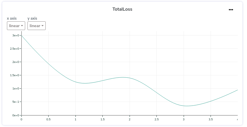
What you just created is what we call a Log asset, now we will dive into it to see how to use it properly and how far we can go.
The LogAsset
To store something related to an experiment and visualize it in Picsellia, you have to store it in what we call a data asset, it is composed of the following properties:
name, it is the name of the tab you will see in your experiment, it can group several data assets.data, is the value, dictionary, array, image, that you want to store.type, the type of visualization your want to render your asset in (e.g array, line-chart, bar-chart...).
from picsellia.types.enums import LogType

experiment.log(name='logs', data=data, type=LogType.LINE)
Supported types
There is moreThese are just basic usage examples of how to display different kinds of data in Picsellia.
To see the complete list of options and arguments for each type, please check the data reference.
We are doing our best to offer you as many data visualization possibilities but it takes time to integrate.
Here is the list of the visualization we support for now. If you need something that is not on the list, please send us a kind message and we will do our best to treat your request a.s.a.p 😊
class LogType(StrEnum):
    VALUE = "VALUE"
    IMAGE = "IMAGE"
    LINE = "LINE"
    TABLE = "TABLE"
    BAR = "BAR"
    HEATMAP = "HEATMAP"
    LABELMAP = "LABELMAP"
    EVALUATION = "EVALUATION"
Single Value
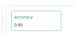
Store one value to be displayed alone. It can be of any type (int, float, str...)
experiment.log(name='accuracy', type=LogType.VALUE, data=0.95)Single values will appear in your experiment dashboard in the summary at the top of the page like this:
Line
A basic line chart:
data = [3, 8, 2, 7, 9]
experiment.log(name='logs', type=LogType.LINE, data=data)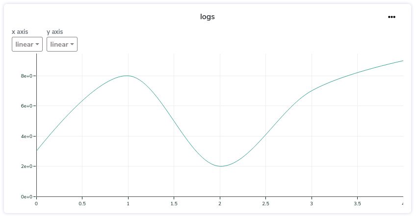
The format of your data to display a line-chart must be one of the following.
List format
If you don't specify it, we automatically increment the steps/x_axis for you so you can just send their values like this:
experiment.log(name='logs', type=LogType.LINE, data=[5, 8, 2, 9, 10])If there is already existing data with the name you provided ('logs' in this example), the values will be appended to the current list of values.
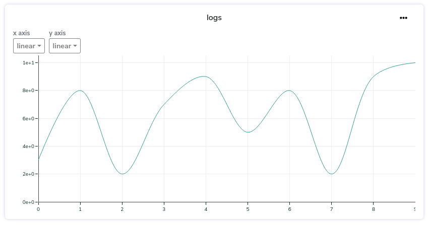
If you want to completely replace the existing values with a brand new list you can set the replace parameter to True
experiment.log(name='logs', type=LogType.LINE, data=[5, 8, 2, 9, 10], replace=True)Custom Axis
If you want to specify your own x_axis steps, you can send the data this way:
data = {
    'steps': [0, 2, 4, 8, 10],
    'values': [0.7, 0.8, 0.9, 0.3, 0.12]
}
experiment.log(name='logs', type=LogType.LINE, data=data)
Multi Lines
You can also visualize multiple lines on the same chart by adding keys to your dictionary (with or without steps):
data = {
    'loss1': [0.45, 0.2, 0.98, 0.47, 0.28],
    'loss2': [0.7, 0.8, 0.9, 0.3, 0.12],
    'loss3': [0.21, 0.47, 0.74, 0.56, 0.86]
}
experiment.log(name='logs', type=LogType.LINE, data=data)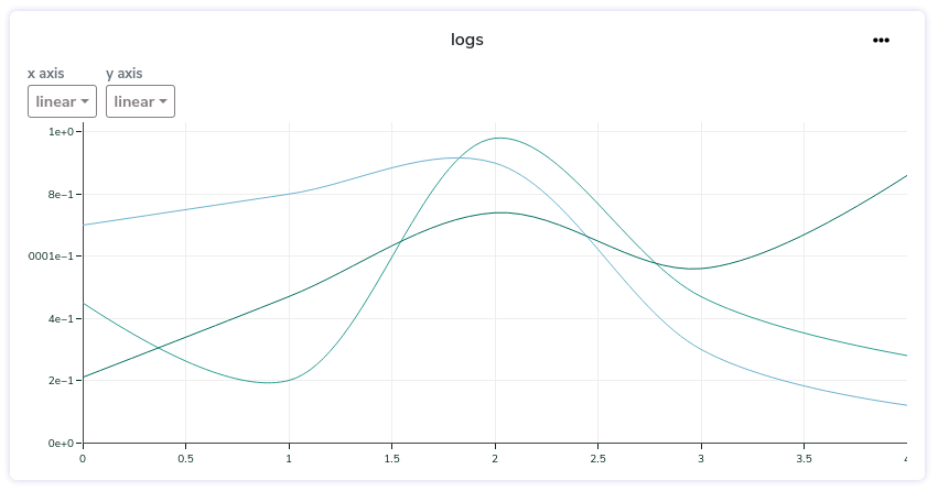
Bar
A basic bar chart:
data = {
    'x': ['car', 'person', 'birid'],
    'y': [5, 8, 2],
}
experiment.log(name='labels', type=LogType.BAR, data=data)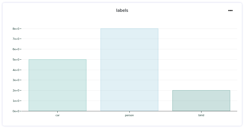
Table
data = {
    "Loss/total_loss": 1.202446,
    "Loss/localization_loss": 0.022069892,
    "Loss/classification_loss": 1.1457626,
    "Loss/regularization_loss": 0.034613654,
    "DetectionBoxes_Recall/AR@1": 	0.0
}
experiment.log(name='metrics', type=LogType.TABLE, data=data)
Image
path = "path/to/my/image.jpg"
experiment.log("img3", type=LogType.IMAGE, data=path)
Heatmap
What is False negative and False positive?Please note that you can send an array of values whose shape is (N+1xN+1) whereas the list of your categories as a length of N. The last dimensions of the array will be labeled as FP (False Positive) and FN (False Negative).
conf = [[33,  0, 13],
       [ 2,  7, 16],
       [10,  0,  0]]

confusion = {
    'categories': ['car', 'pedestrian'],
    'values': conf.tolist()
}
exp.log(name='confusion', data=confusion, type=LogType.HEATMAP)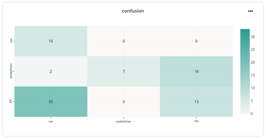
Updated 9 months ago