Deployments - Dashboard metrics
The Dashboard tab of a Deployment displays many different metrics that all aim at giving users a clear and precise overview of the ModelVersion in the frame of the current Deployment.
Those metrics are divided into two categories:
- Unsupervised metrics
- Supervised metrics
1. Unsupervised Metrics
A. Definition
An Unsupervised metric is a metric that is computed only from the PredictedAsset and/or the Prediction done by the ModelVersion for this particular image. It means that no human intervention is required to compute it.
The Unsupervised Metrics are computed for all the Predicted Assets logged to the Deployment. They are convenient because they do not require any human action or input to be computed.
Below are listed and detailed all the Unsupervised metrics you can access from the Dashboard of a Deployment.
The Dashboard displayed differs forModelVersionthat are doing ClassificationIndeed, as many metrics displayed below are not applicable for Classification,
B. Latency
The Latency chart allows you to visualize the latency of the ModelVersion to perform the inference for each PredictedAsset logged in the current Deployment. In case a Shadow ModelVersion is deployed, its latency is also displayed with the grey line.
Each PredictedAsset logged corresponds to a point on the chart.
You also have access to the timestamp of the inference by hovering over any point on the chart.
By clicking on a point the related PredictedAsset will be displayed with its Prediction in the Prediction tab.
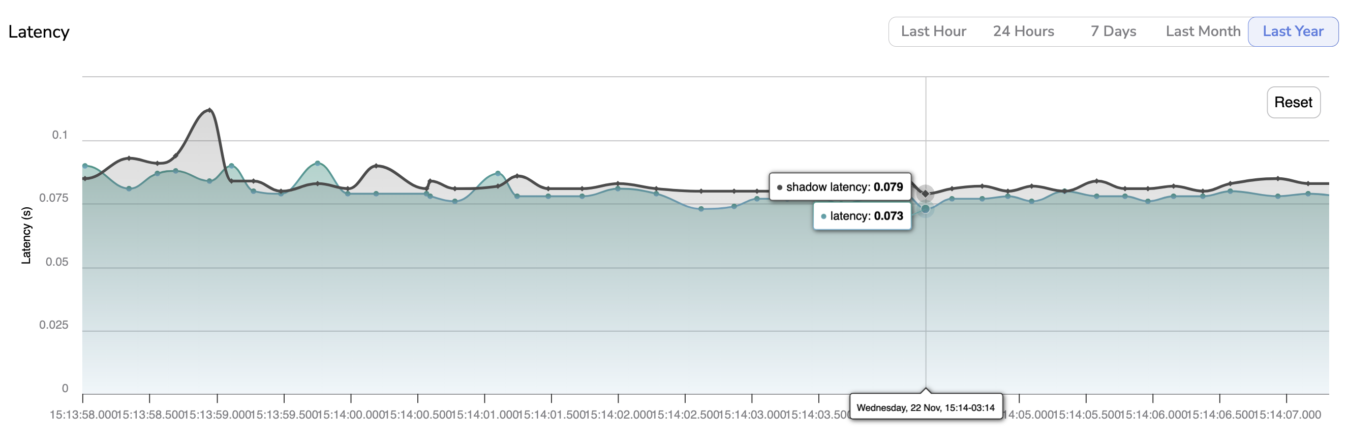
Latency chart
If your ModelVersion is deployed on the Picsellia Serving Engine, the latency is automatically computed and logged on the proper Deployment. In case, the ModelVersion is deployed on your own infrastructure the inference latency information has to be included as an argument in the use of the monitor() function. As explained here, that function is used each time an inference is done on an external infrastructure to log the PredictedAsset and the Prediction on the related Picsellia Deployment.Please note you can easily navigate across this graph by using the predefined time-period available (i.e. Last Hour, 24 Hours, 7 Days, Last Month, Last Year). In addition, you can zoom on a particular time frame using the pointer and reset this zoom with the Reset button.
C. Heatmaps
The Heatmaps chart represents the spatial distribution of the Shapes (Bounding-boxes or Polygons) for all Prediction logged in the current Deployment.
Picsellia generates one heatmap per Label and you can switch from one heatmap to another.

Heatmaps chart
The clock icon means that the chart might not be fully up-to-date. Hovering the icon will display the last date of chart computation. So you can manually launch the computation of the Heatmaps with the button Compute.
D. Last Predictions
This metric simply displays a quick overview of the last 5 Predictionslogged in the current Deployment.

Last Predictions metric
As displayed above, are diplayed the PredictedAsset (i.e the image) and the Prediction (Shapes predicted by the ModelVersion).
This is not real-timePlease bear in mind that if not real-time, new predictions might appear during the time in your dashboard
E. Outlier score
The Outlier score is a score that is computed by Picsellia for each PredictedAsset logged on a Deployment.
This score basically represents the degree of differentiation between a PredictedAsset and the DatasetVersion used to train the deployed ModelVersion.
Training Data initialization requiredTo compute Outlier score, you need to indicate to the current
DeploymentwhatDatasetVersionhas been used to train the currently deployedModelVersion. To do so, you can follow the procedure detailled here.
The higher this score is, the more the PredictedAsset can be considered as an outlier.
Each PredictedAsset logged corresponds to a point on the chart, hovering on a point will display its inference date and computed Outlier score.
By clicking on a point the related PredictedAsset will be displayed with its Prediction in the Prediction tab. Please note you can easily navigate the graph as you can zoom on a particular time frame using the pointer and reset this zoom with the Reset button.
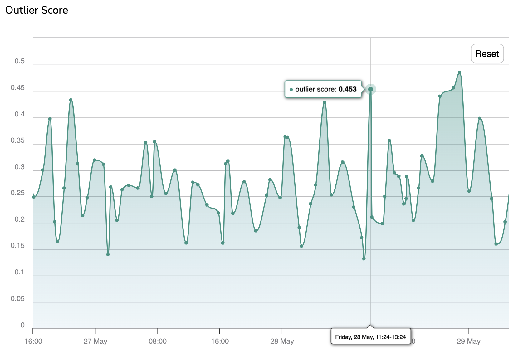
Further details on how the Outlier score is computed are available on the dedicated page:
👉 AE Outlier Check it out!
The PredictedAsset considered as outliers by the ModelVersion can be judiciously added through the FeebackLoop to the training DatasetVersion that will be used to train a further version of the deployed ModelVersion. This mechanism which is detailed here aims at increasing the ModelVersion performances by improving the quality of the DatasetVersion with images identified as outliers in a Deployment.
F. KS Drift
The KS Drift is a metric that is based on the Outlier score that aims at identifying a persistent drift in terms of differentiation between the images from the DatasetVersion used to train the currently deployed ModelVersion and the PredictedAssets that have been logged in the Deployment. If a drift is detected through that metric, it means that the images sent to the ModelVersion for inference are too different from the images used to train the ModelVersion, so very likely, the ModelVersion performances will be impacted.
Training Data initialization requiredAs the KS Drift is based on the Outlier score, it also requires to you indicate to the current
DeploymentwhatDatasetVersionhas been used to train theModelVersiondeployed. To do so, you can follow the procedure detailled here.
If the distance between the Production and the Training lines is growing, it means that the data are drifting. A drift can be automatically detected by setting up an Alert as detailed here.
Please note you can easily navigate the graph as you can zoom on a particular time frame using the pointer and reset this zoom with the Reset button.
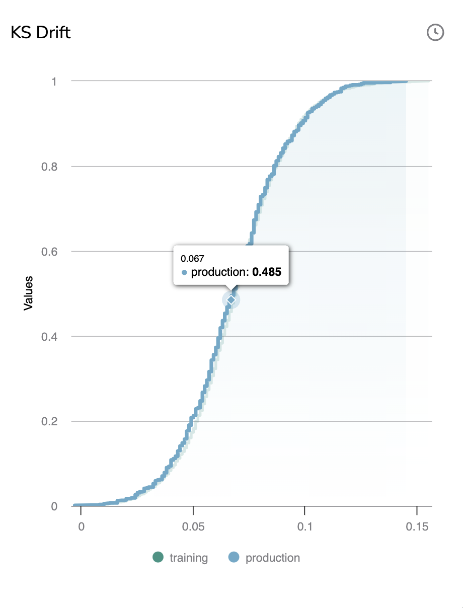
The clock icon means that the chart might not be fully up-to-date. Hovering the icon will display the last date of chart computation. So you can manually launch the computation of the KS Drift with the button Compute.
Further details on how the KS Drift is computed are available on the dedicated page:
👉 KS Drift ( Kolmogorov-Smirnov Test) Check it out!
G. Label Distribution
The Label Distribution graph is a multi-line graph that displays for each Prediction the number of Shape per Label. It allows you to have a rough idea of the Label distribution and quantity for the logged Prediction.
Each Prediction logged corresponds to a point on the chart, hovering over a point will display its inference date and the number of Shape per Label for this particular Prediction.
By clicking on a point, the related PredictedAsset will be displayed with its Prediction in the Prediction tab.
Please note you can easily switch to a single-line view that displays the distribution of only one Label. To do so, you need to select theLabel in the top-right corner of the graph.
In addition, you can zoom on a particular time frame using the pointer and reset this zoom with the Reset button.
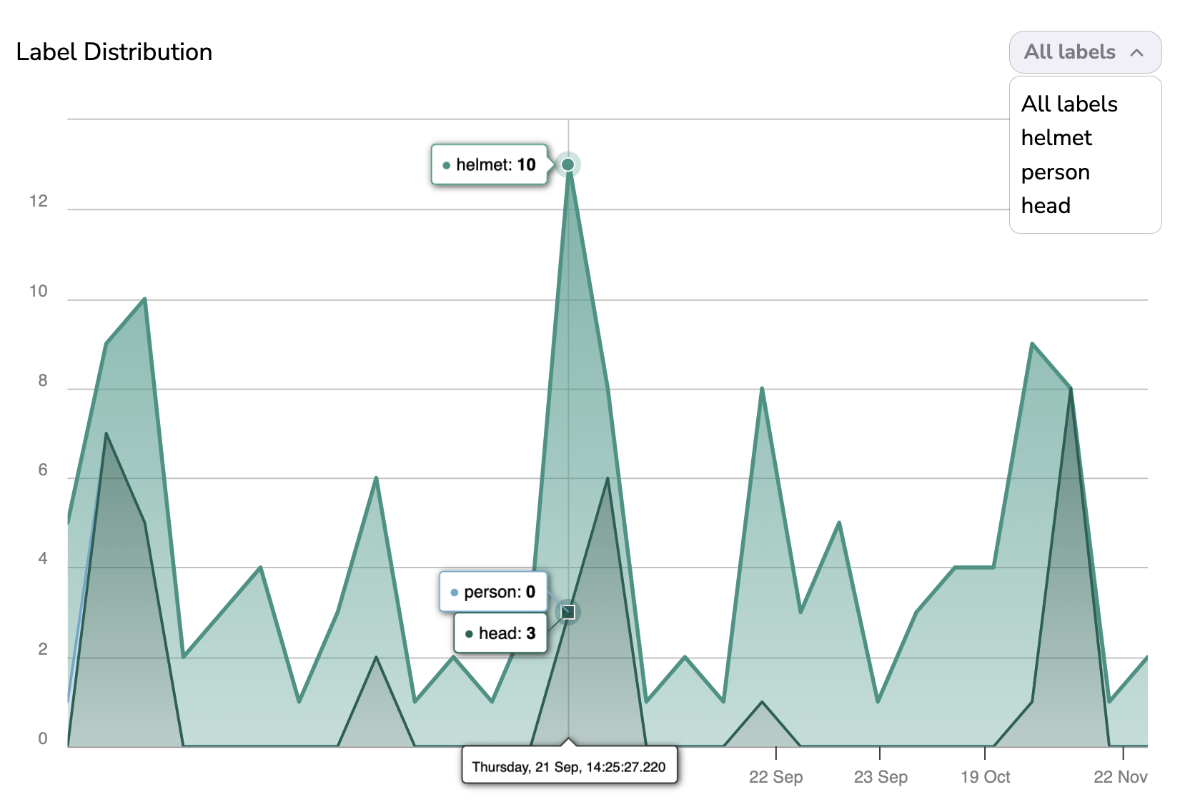
Please note you can easily navigate the graph as you can zoom on a particular time frame using the pointer and reset this zoom with the Reset button.
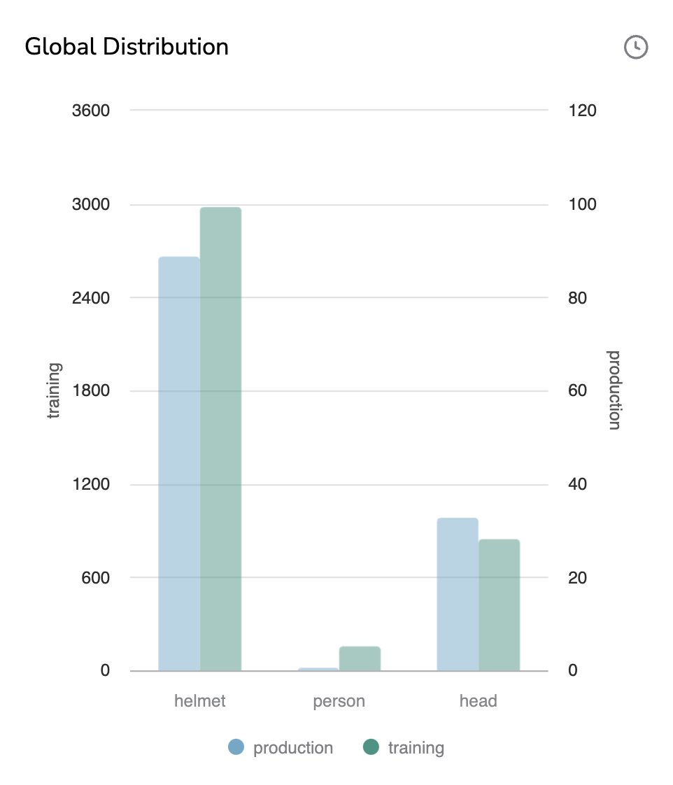
H. Global Distribution
The Global Distribution graph is a bar chart graph that displays per Label the number of Shape in the training DatasetVersion and in the logged Prediction. It allows you to ensure that the distribution of Shape across Label is globally the same between the DatasetVersion used to train the ModelVersion and the Prediction done by this ModelVersion.
Training and Production bars have their own scale, as the point here is to compare the distribution among Label.
By hovering a bar, the number of related Shape will be displayed.
Global Distribution chart
The clock icon means that the chart might not be fully up-to-date. Hovering the icon will display the last date of chart computation. So you can manually launch the computation of the Global Distribution with the button Compute.
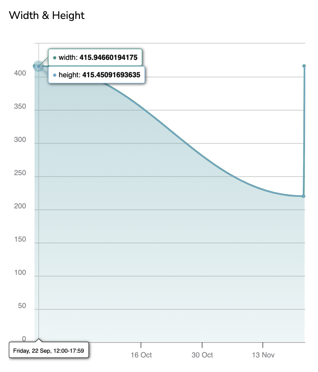
I. Width & Height
The Width & Height graph basically allows you to monitor the evolution of the PredictedAsset dimensions over time.
For instance, it can help you detect that suddenly, the PredictedAsset change in orientation which explains why the ModelVersion performances decayed.
Each PredictedAsset logged corresponds to a point on the chart, hovering over a point will display its inference date, the PredictedAsset Width and Height.
By clicking on a point, the related PredictedAsset will be displayed with its Prediction in the Prediction tab.
Width & Height graph
The clock icon means that the chart might not be fully up-to-date. Hovering the icon will display the last date of chart computation. So you can manually launch the computation of the Area Distribution with the button Compute.
Please note that you can zoom on a particular time frame using the pointer and reset this zoom with the Reset button.
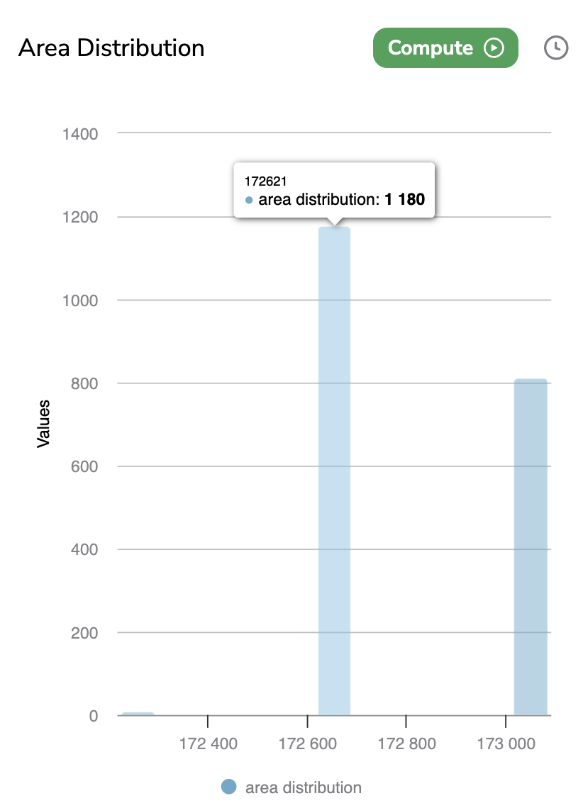
J. Area Distribution
The Area Distribution chart is a bar chart that displays per existing area values the number of PredictedAsset logged in the current Deployment.
The area of a PredictedAsset is computed by multiplying the Width by the Height.
By hovering a bar, the number of related PredictedAsset with the related area will be displayed.
Area Distribution chart
The clock icon means that the chart might not be fully up-to-date. Hovering the icon will display the last date of chart computation. So you can manually launch the computation of the Area Distribution with the button Compute.
Please note that you can zoom on a particular time frame using the pointer and reset this zoom with the Reset button.
K. Ratio Distribution
For each PredictedAsset, Picsellia is computing the ImageRatio.
ImageRatio = Width / Height
From those values, an ImageRatio Distribution view as a histogram segregated in 6 intervals is displayed. Those intervals are defined as follows:
- Square : ImageRatio == 1
- Tall : ImageRatio < 0.5
- Very-tall : 0.5 < ImageRatio < 1
- Vide: 1 < ImageRatio < 1.5
- Very-wide : 1.5 < ImageRatio < 2.5
- Extrem-wide : 2.5 > ImageRatio
By hovering a bar, the number of PredictedAsset with an ImageRatio belonging to the interval will be displayed.

Ratio Distribution chart
The clock icon means that the chart might not be fully up-to-date. Hovering the icon will display the last date of chart computation. So you can manually launch the computation of the Ratio Distribution with the button Compute.
Please note that you can zoom on a particular time frame using the pointer and reset this zoom with the Reset button.
2. Supervised Metrics
A. Definition
A Supervised metric is a metric that is computed from the predicted image, the Prediction done by the ModelVersion, and the human review of this prediction for this particular image. Supervised metrics are used to assess ModelVersion performances in terms of precision by comparing the Prediction done by the ModelVersion and the GroundTruth provided by a human.
Below are listed and detailed all the Supervised metrics you can access from the Dashboard of a Deployment.
The Supervised Metrics are based on a comparison between the Prediction and the human review. So it means that human reviews are required to compute such metrics. Here is the page related to the human review of Prediction.
Supervised Metrics gives an accurate overview of the ModelVersion performances in terms of recognition.
B. Average Precision
The Average Precision (ap) is a line chart that displays for each Prediction reviewed with the Prediction Review tool the computed Average Precision value. Please note that if a Shadow Model is deployed in the current Deployment, an additional black line will be added in the chart to display the Average Precision value computed for the Shadow Prediction also.
By clicking on a point, the related PredictedAsset will be displayed with its Prediction in the Prediction tab.
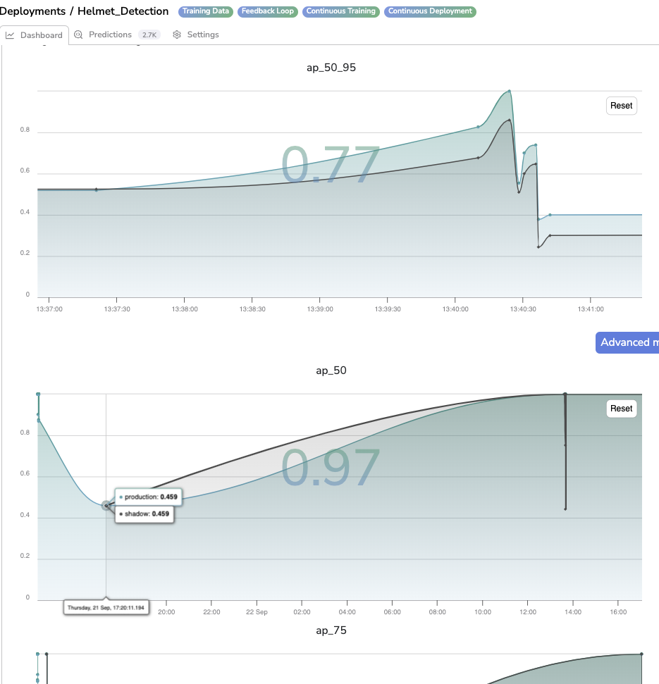
Average Precision for different IoU
Please note that you can zoom on a particular time frame using the pointer and reset this zoom with the Reset button.
As you can see the Average Precision value for each reviewed Prediction is computed for several IoU (Intersection over Union) so several Average Precision charts are generated (i.e. one per IoU).
The available IoU are: ap_50_95, ap_50, ap_75, ap_50_95_small, ap_50_95_medium, ap_50_95_large.
In addition, the value displayed in the background of each chart is actually the mean of all the logged Average Precision values (for Champion Prediction)
C. Average Recall
The Average Recall (ar) is a line chart that displays for each Prediction reviewed with the Prediction Review tool the computed Average Recall value. Please note that if a Shadow Model is deployed in the current Deployment, an additional black line will be added in the chart to display the Average Recall value computed for the Shadow Prediction also.
By clicking on a point, the related PredictedAsset will be displayed with its Prediction in the Prediction tab.
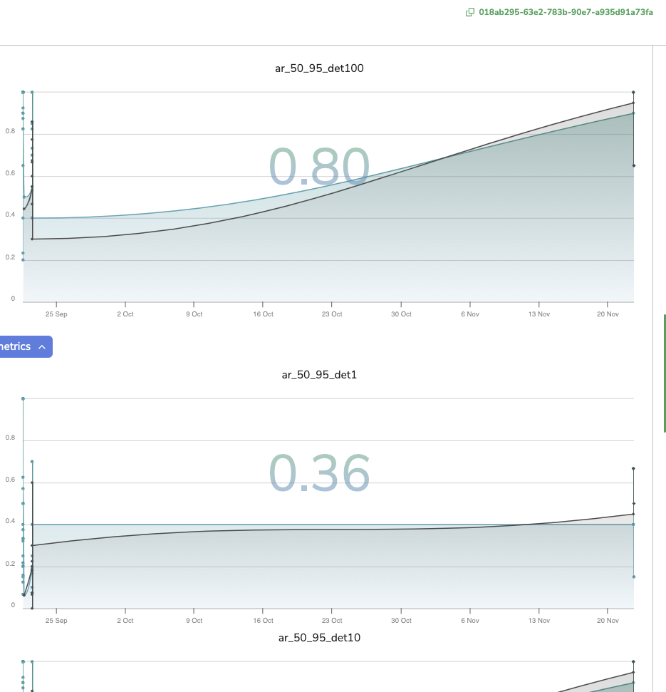
Average Recall for different IoU
Please note that you can zoom on a particular time frame using the pointer and reset this zoom with the Reset button.
As you can see the Average Recall value for each reviewed Prediction is computed for several IoU (Intersection over Union) so several Average Precision charts are generated (i.e. one per IoU).
The available IoU are: ar_50_95, ar_50, ar_75, ar_50_95_small, ar_50_95_medium, ar_50_95_large.
In addition, the value displayed in the background of each chart is actually the mean of all the logged Average Recall values (for Champion Prediction)
3. Dashboard for Classification
In case the ModelVersion deployed in the current Deployment has Classification as Detection Type, the metrics displayed in the Dashboard tab will differ a bit.
You will retrieve the following Metrics already defined previously: Latency, Last Predictions, Outlier Score, KS Drift, Label Distribution, Global Distribution, Width & Height, Area Distribution, Ratio Distribution.
For Classification, here are the additional metrics:
A. Confusion Matrix
The Confusion Matrix is basically a table in which each entry is a Label in the LabelMap of the deployed ModelVersion.
The Confusion Matrix is a Supervised Metric that aims at summarizing the Prediction against the Reviews.
For each cell, you will retrieve the number of Prediction with Label X but reviewed with Label Y.
The idea is that if X=Y it means that the ModelVersion predicted correctly.
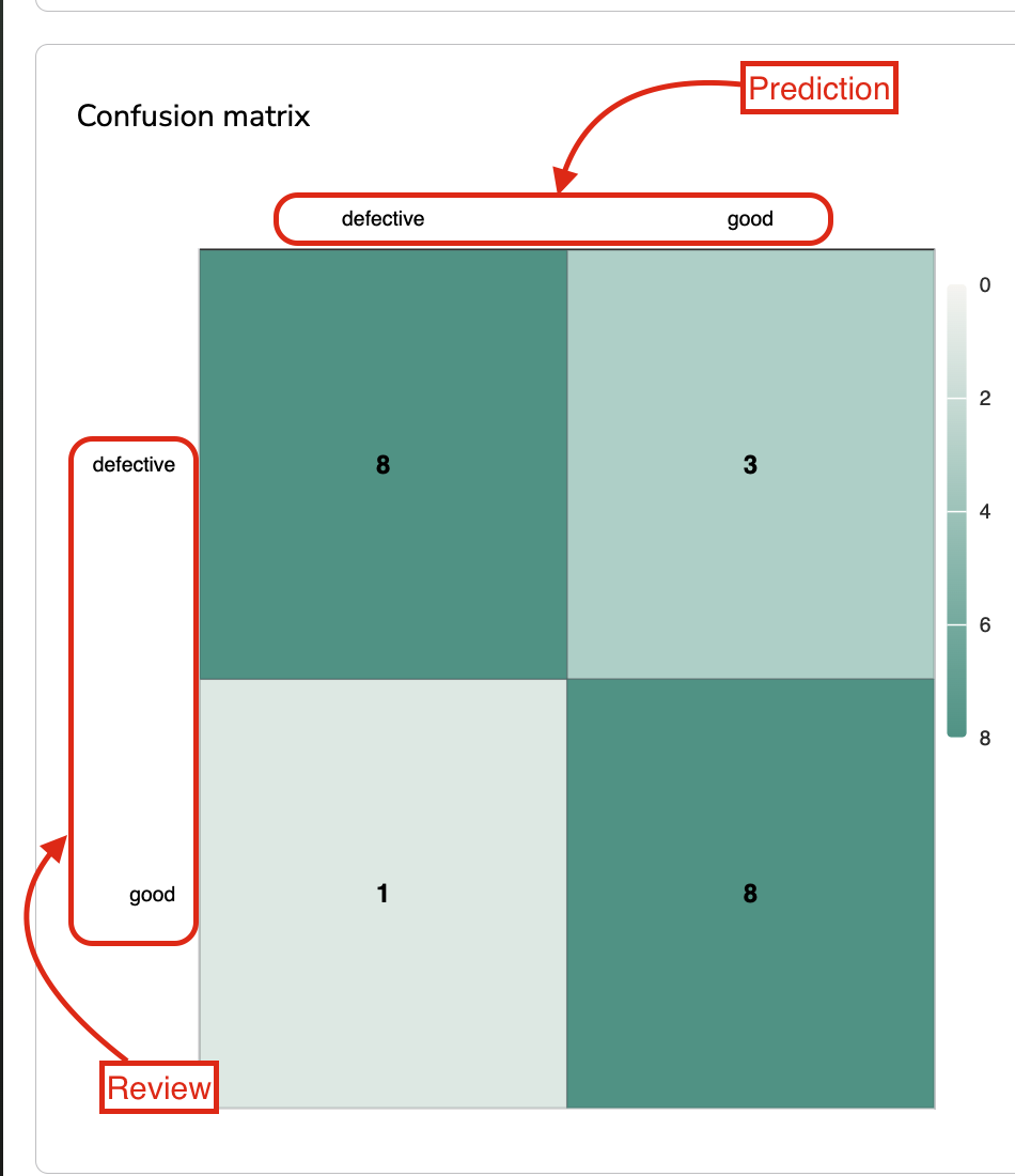
Confusion Matrix
B. Support Distribution
The Support Distribution is a pie chart that represents the distribution of Label among the Prediction logged in the current Deployment.
Please note that the Label taken into account for this metric is always the Review, if the Review doesn't exist yet, it is the Prediction that is considered. For that reason, this metric is considered as a Supervised Metric.
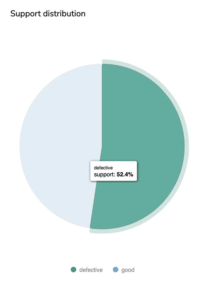
Support Distribution
C. Metrics by label, Macro Average Metrics, Weighted Average Metrics
Based on the Reviews performed until now, on all the Prediction logged in a given Deployment, the following metrics are computed Precision, Recall, F1-Score.
Those Supervised Metrics are displayed by three different charts. One displays these metrics by Label, another displays the average value, and the last one the weighted average value.
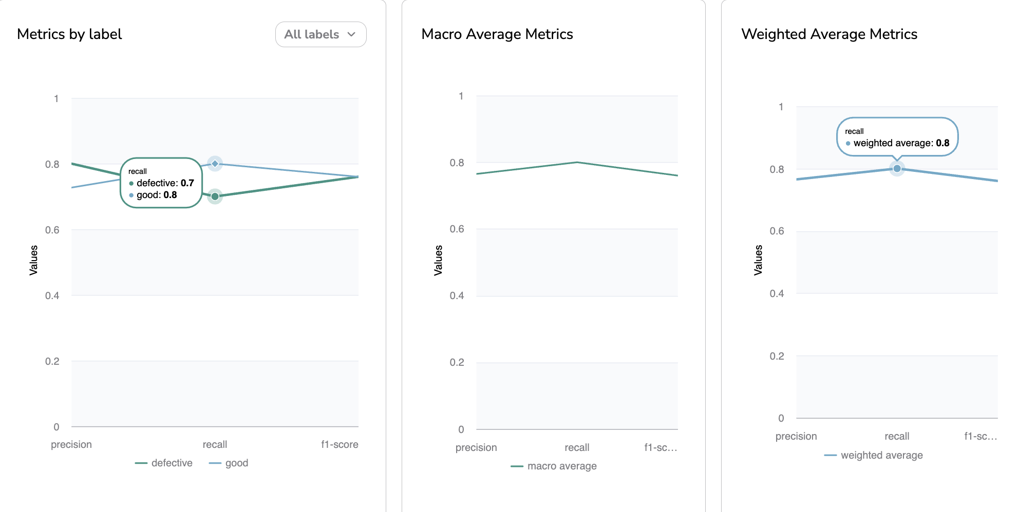
Precision, Recall and F1-Score
Updated about 1 year ago