

Experiment overview
An Experiment is a Picsellia object that mainly aims at tracking and structuring the training of a ModelVersion.
Navigating among the tabs offered by a Picsellia Experiment, you'll always be able to visualize, at the top, the Experiment path displaying the current Project and Experiment names, along with the Launch Experiment and Export as Model buttons. This path also contains clickable links allowing you to navigate smoothly across Project and Experiment.
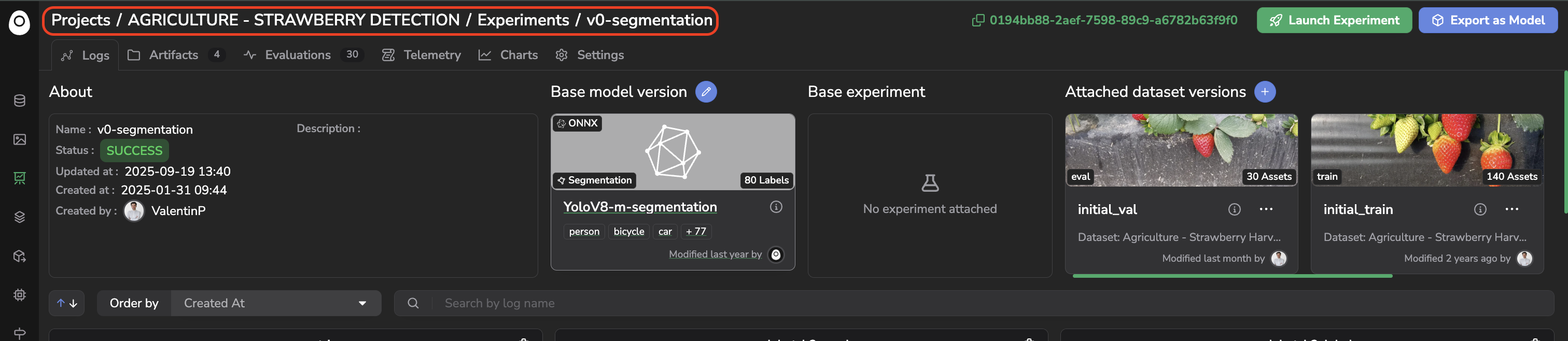
Experiment path
1. Logs
The Logs tab displays two main types of information:
- The
Experimentinformation in the header. - The Metrics defined in the training script, which allow you to assess the quality of the training.
A. Header
The very first added value of the Picsellia Experiment system is to bring structure and traceability to your whole Organization. This is why the header of the Logs tab displays all the information related to the current Experiment, allowing you to get a complete understanding of it.
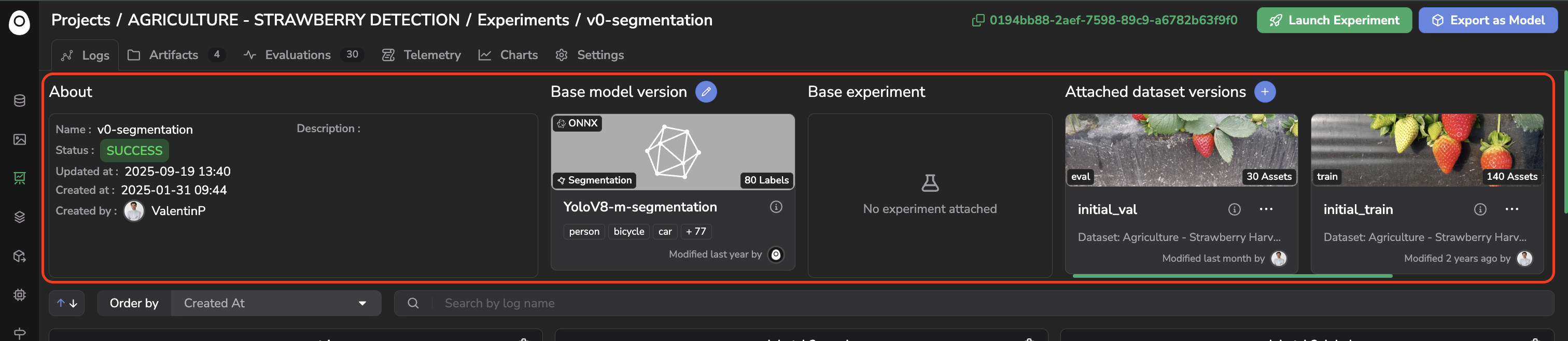
Experiment Header
The About section displays all the contextual information related to the Experiment, such as its Name, Status, Description, Creation date, Creator, and last update date. You can also retrieve the Base model version used, if any, the Base experiment used, if any, and the DatasetVersion attached to the current Experiment, each shown with its alias.
B. Metrics
Under the header, you'll find the Experiment Tracking dashboard, composed of placeholders dedicated to the display of Metrics computed in the frame of the Experiment.
Those placeholders are empty right after Experiment creation, as they will be filled by the training script as soon as the model training is launched.
Parameters and LabelMapThe only placeholders populated right after
Experimentcreation are two tables displaying theLabelMapand the parameters with default values inherited, if existing, from the Base architecture selected for theExperiment.
The fact that the Experiment Tracking dashboard is filled with Metrics by the training script means that this dashboard is fully customizable. By integrating your own ModelVersion and training script into the Picsellia platform, you have the opportunity to define the Metrics displayed in the Experiment Tracking dashboard for each Experiment using your training script as a Base architecture.
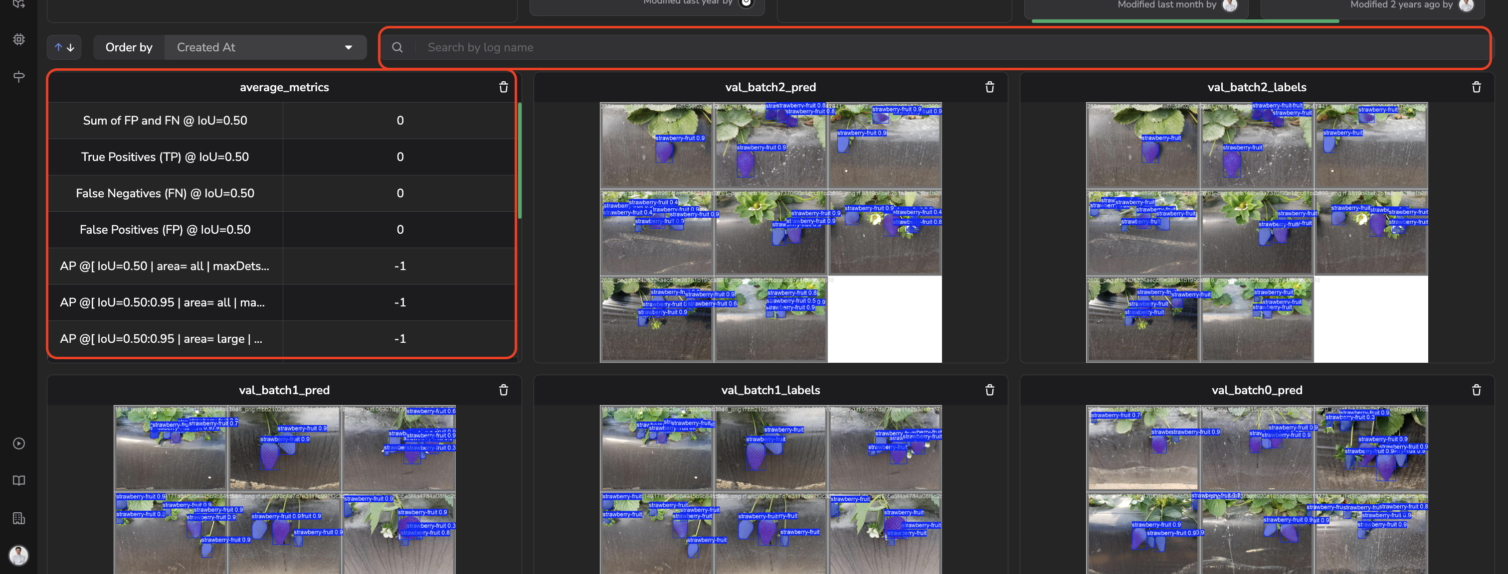
Example of a Custom Metrics logged by the training script
Each Metrics logged has its own name. Details about the available Metric types can be found here. The process to integrate a ModelVersion and a training script as a Picsellia ModelVersion is detailed here.
Above the dashboard, a search bar lets you filter Metrics by name. Each Metric tile also carries a trash icon, letting you delete it, and lets you configure its X axis and Y axis scale (Linear or Logarithmic), which is useful to read metrics that vary over several orders of magnitude, such as a loss curve.
A Metric can also be opened in a modal, which displays it over the whole page. On a dashboard carrying a dozen tiles, this is how you read a dense loss curve or a wide confusion matrix without leaving the Experiment.
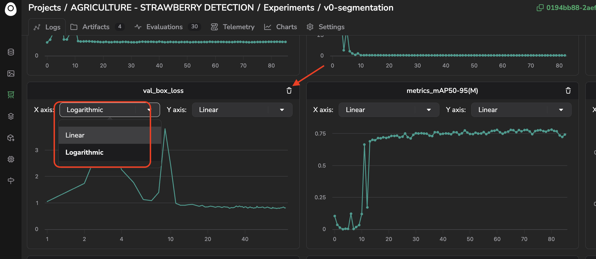
Metric configuration
If you use, as Base architecture, a ModelVersion from the Public Registry, the Metrics displayed in the Experiment Tracking dashboard at the end of the training will be the ones defined by the Picsellia team while packaging the ModelVersion.
Below, you will find, for instance, some Metrics logged in the Experiment Tracking dashboard of an Experiment using the ModelVersion YoloV8-Classification / YoloV8-x, available in the Public Registry, as Base architecture.
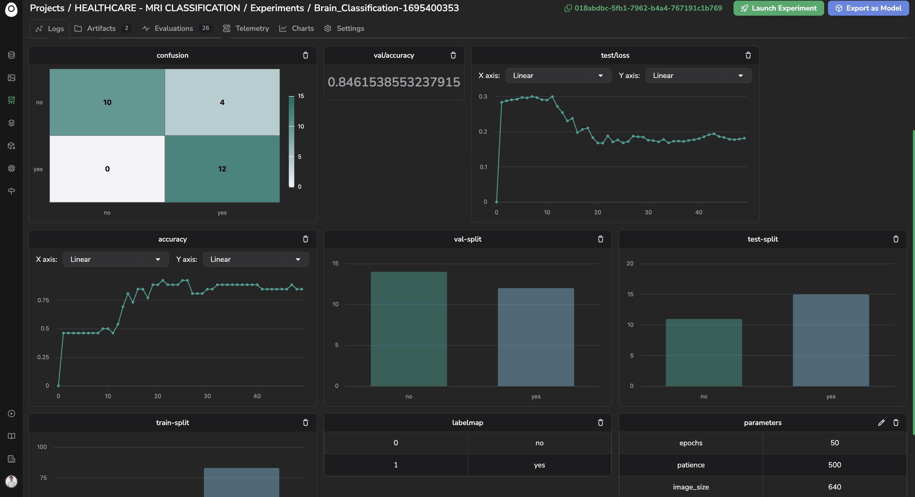
Example of Metrics with various types
2. Artifacts
The Artifacts tab is crucial because it stores all the files related to the Experiment that will define the ModelVersion you are aiming to create through it.
Each file is named an Artifact and is associated with a file and an Artifact name.
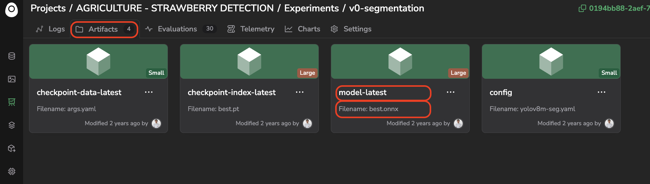
Experiment Artifact
It is important to know that, right after Experiment creation, the model files of the Base architecture will be inherited, if existing, as Experiment files under the Artifacts tab.
Filename is different from Artifact nameEach Artifact has a name on the Picsellia platform, which can differ from the name of the file it stores. An
Experimentis a moving object: it can, for instance, be initialized with the weights inherited from the Base architecture as an Artifact, but after training, those weights will be overwritten with a new weight file under the same Artifact.
The Artifacts tab lets you visualize each Artifact attached to the Experiment, especially its name and filename. You can also use the ... button to delete the Artifact or download its associated file.
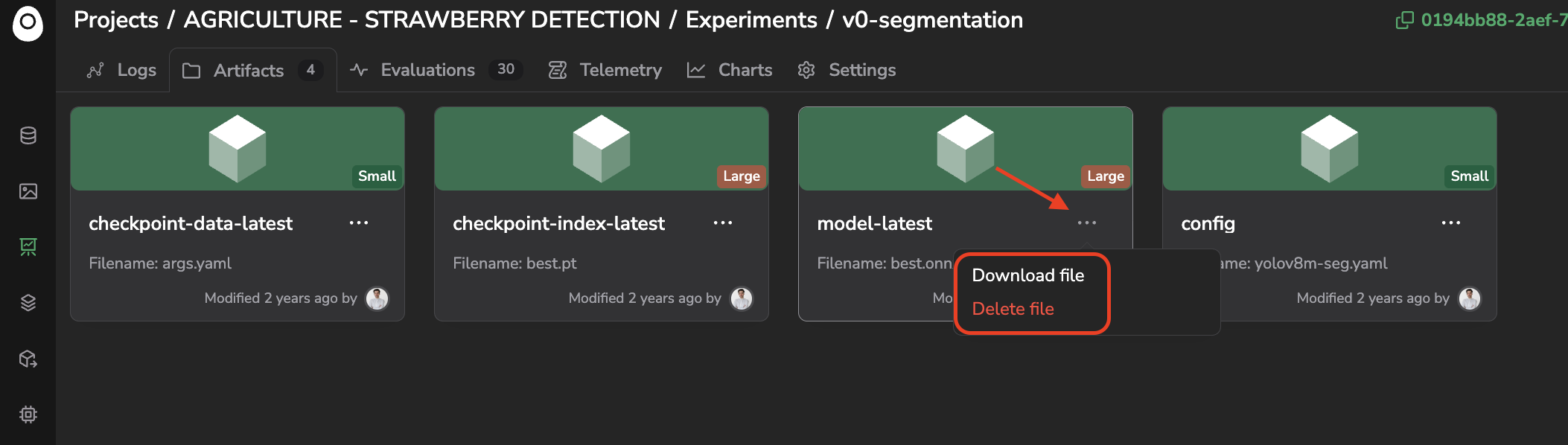
Download or Delete file related to an Artifact
3. Evaluations
For each Experiment, you have access to a tab named Evaluations.
This interface allows you to visualize the predictions performed by the freshly trained ModelVersion on a dedicated set of Asset and to compare those predictions with the ground truth. For each evaluated Asset, you also get access to metrics such as average recall and average precision, to get a precise view of the ModelVersion performances.
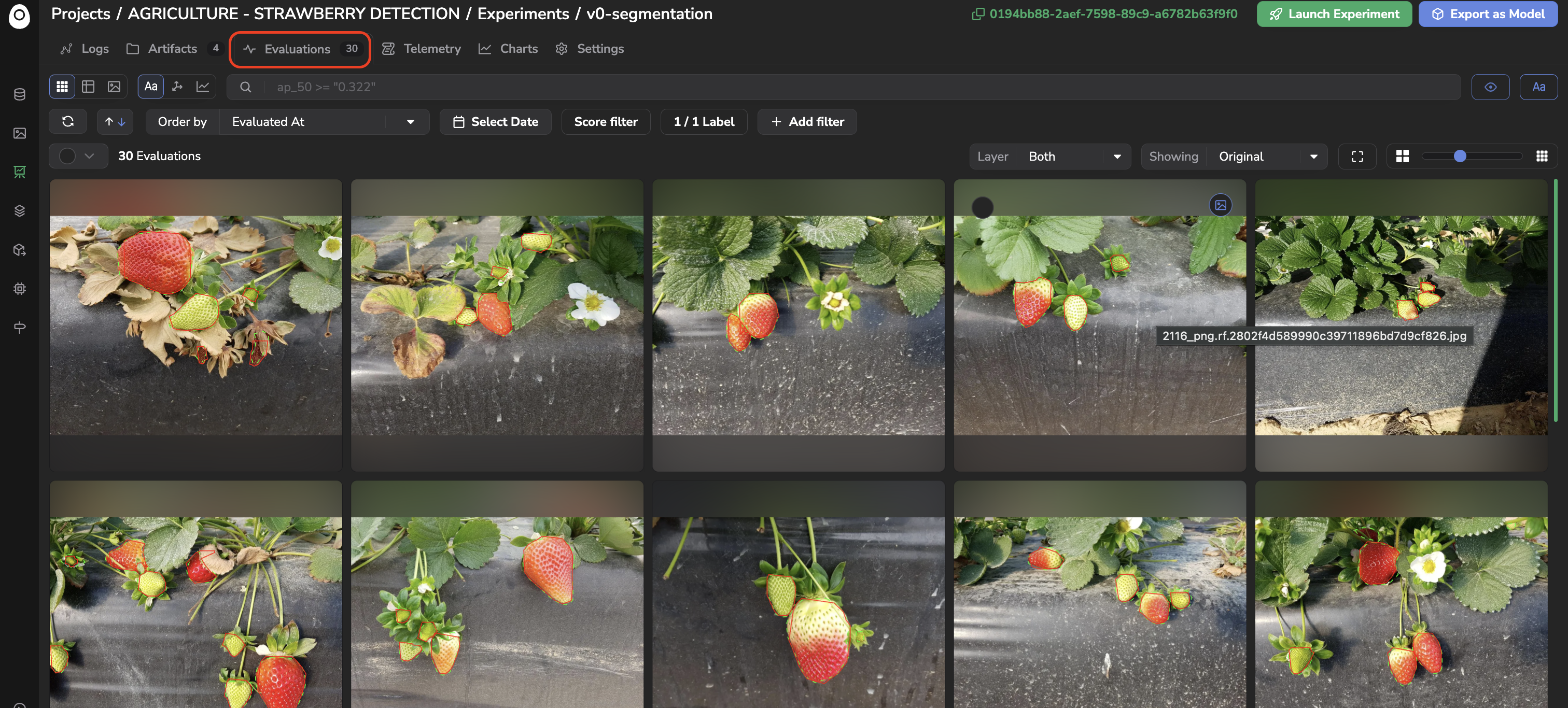
Evaluation interface
An Evaluation is, at its core, an image overview: the same Grid, Table, and Details views, the same search bar, and the same ordering and filtering tools you already know from the Datalake and a DatasetVersion's Assets overview. What makes it specific is that each image is displayed with both the ground truth and the ModelVersion's prediction overlaid on it.
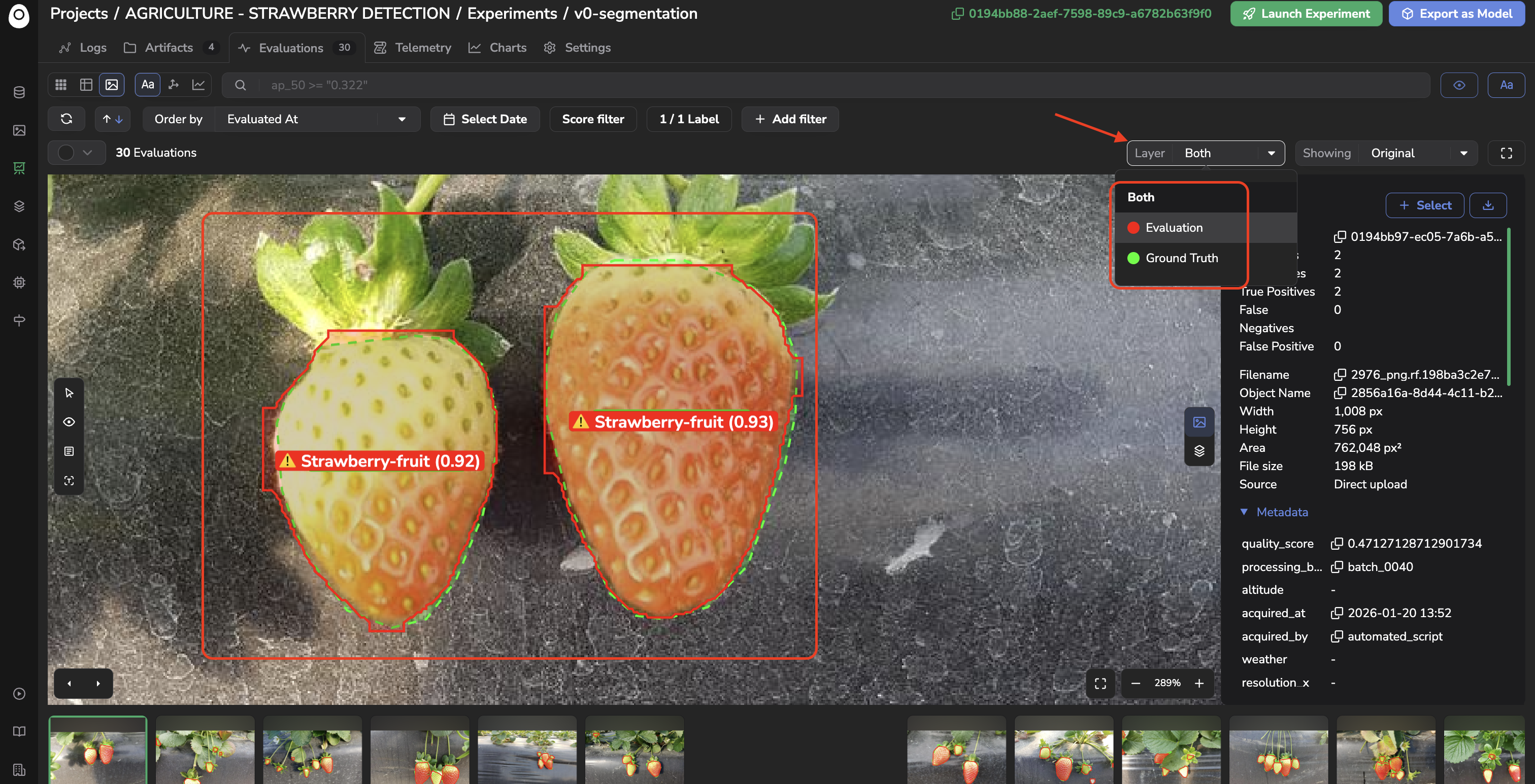
Ground Truth and Evaluation overlaid
That overlay is the whole point. An aggregate score tells you a ModelVersion is 91% accurate; it doesn't tell you which images it fails on, or why. Looking at the ground truth and the prediction side by side on the actual Asset is what lets you build an intuition for the kind of mistakes your ModelVersion makes — a confused class, a missed small object, a box that's shifted just enough to fail the IoU threshold — the difference between "the model isn't good enough yet" and "the model consistently struggles on trucks photographed at night."
As with the Datalake and DatasetVersion, the Evaluations interface offers three exploration modes, switchable next to the search bar:
-
Query Language (the default), letting you filter
Evaluationwith the same query syntax used across the platform.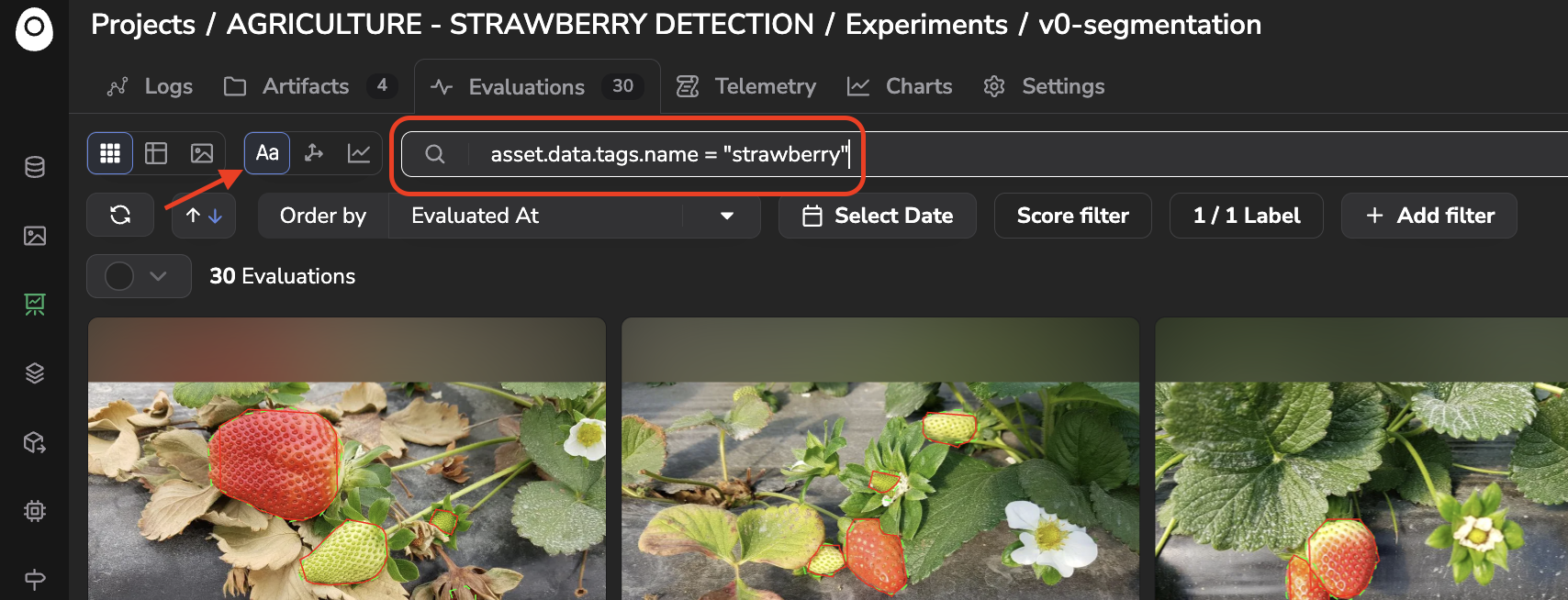
Query Language exploration mode for Evaluations
-
Embeddings, letting you explore your
Evaluationvisually and semantically — by similarity, by text, or through a UMAP projection — detailed in Settings > Embeddings below.
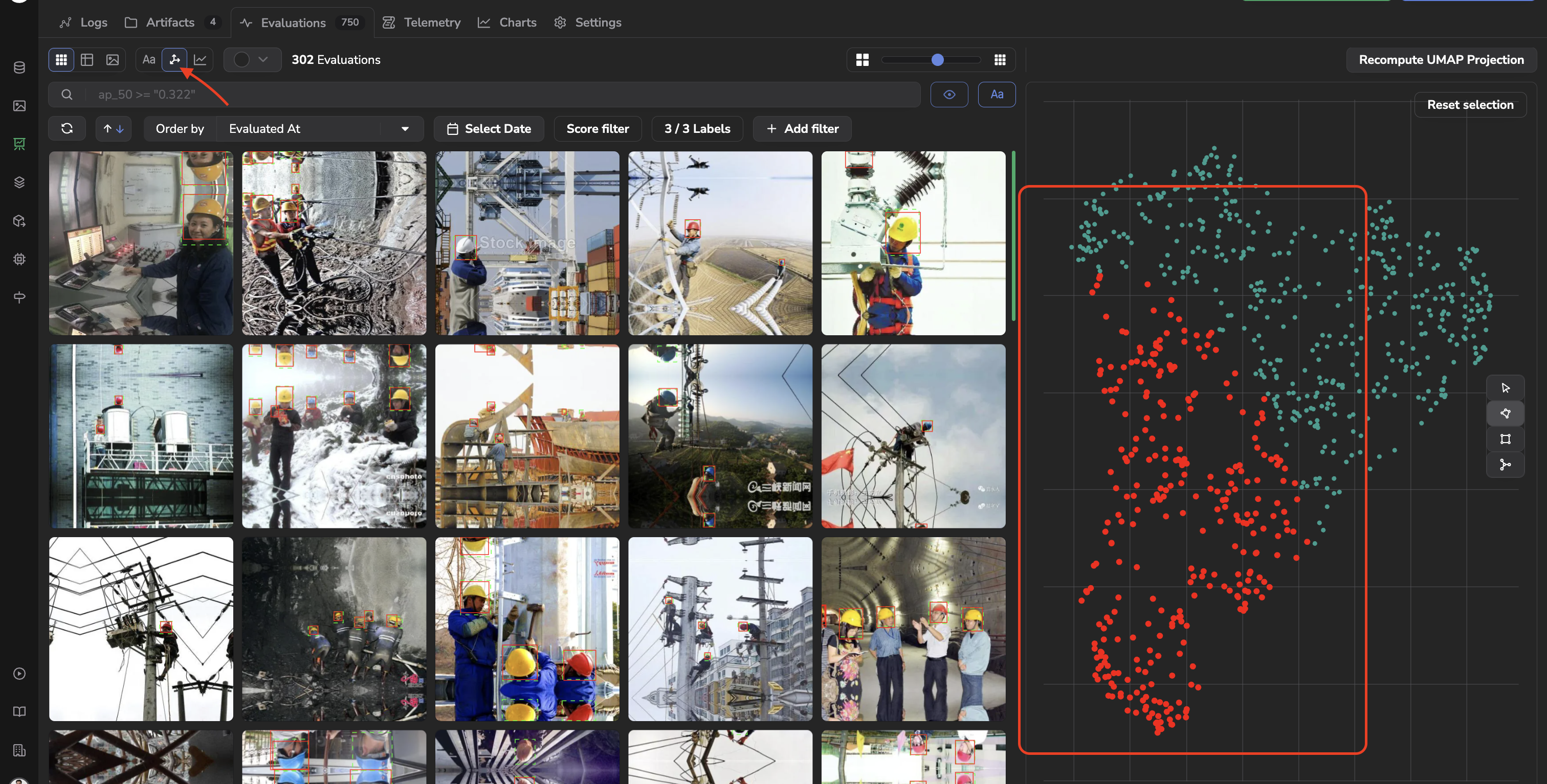
Embedding exploration mode for Evaluations
- Charts, letting you build aggregate visualizations over your
Evaluation, detailed in Charts.
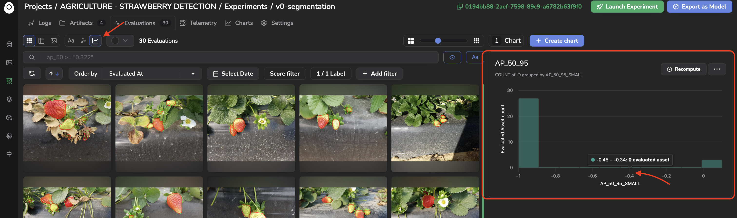
Charts exploration mode for Evaluations
Combining any of these two — ex: clustering Evaluation by visual similarity with Embeddings, then reading off the aggregate error rate of that cluster with a Chart — is what turns "the model is wrong sometimes" into "the model is wrong on this specific slice of data," which is precisely the kind of finding that tells you what to fix next: relabel a confusing class, collect more examples of an underrepresented case, or adjust the Base architecture.
The computing and logging of an Evaluation should be done by the training script after the training step. The Asset to evaluate can be selected either by attaching to the Experiment a dedicated DatasetVersion for evaluation (for instance with the alias eval, as is the case when using a ModelVersion from the Public Registry as Base architecture) or by the script itself, among the DatasetVersion attached. To have a point of truth, the Asset selected for evaluation should have been annotated in a DatasetVersion. More details about the Evaluations interface are available here.
In all cases, it is up to the script author to define the evaluation strategy (image selection, Evaluation logging, metrics computation...). A tutorial detailing how to integrate Evaluation in your training script is available here.
Comparison toolsPicsellia also offers dedicated comparison tools: one for comparing
Metricsacross severalExperiment(their Logs), and one for comparingEvaluationacrossExperimenton a sharedDatasetVersion, image by image. Both are detailed in Comparison.
4. Telemetry
The Telemetry tab offers a way to visualize in real time all the information logged by the training script during its execution. The script must log information and make it available in the Telemetry tab, as explained here.
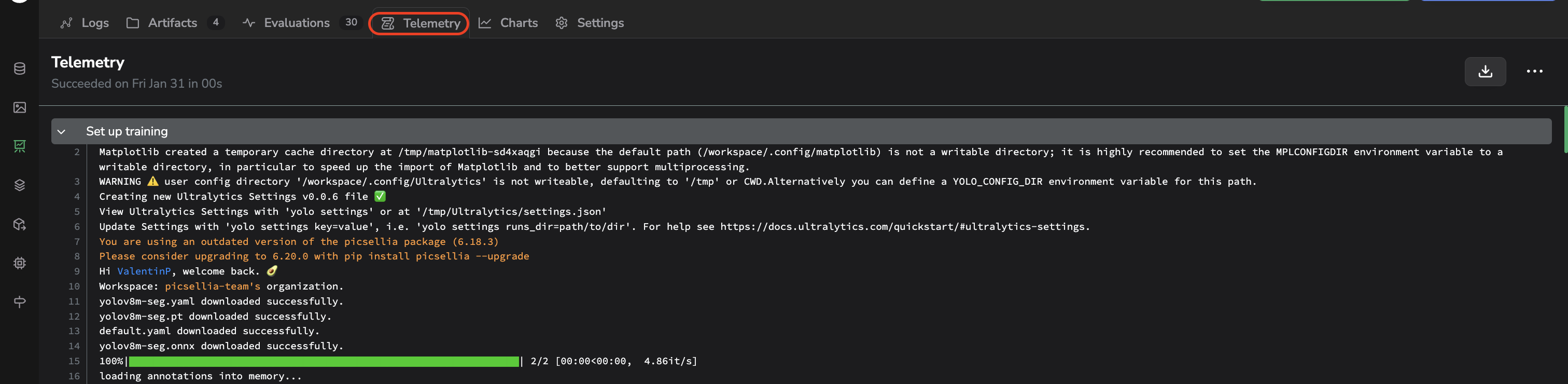
Telemetry tab
5. Charts
Reading Evaluation one image at a time tells you about individual failures; Charts tell you about patterns. The Charts tab lets you build custom aggregate visualizations over your Experiment's Evaluation results, independently of the auto-generated tiles of the Logs tab.
Charts are available in two places, exactly as they are for the Datalake and a DatasetVersion:
- The Charts tab itself, listing every chart created so far.
- The Charts option of the Evaluations exploration mode selector, which displays the
Evaluationgrid alongside theChartspanel for side-by-side exploration.
Clicking on a bar of a chart automatically filters the Evaluation displayed to only the ones matching that bar, by applying the equivalent query in the search bar — this drill-down is what makes the side-by-side mode powerful: spot an anomaly on a chart, then immediately look at the corresponding images right next to it.
What sets Evaluation Charts apart from Datalake or DatasetVersion Charts is that you can aggregate on the Evaluation's own metrics, not only on properties of the underlying Asset or Data. Those metrics are either:
- Computed automatically by Picsellia for every
Evaluation— the COCO-style detection metrics, such as AP_50_95, AP_50, AP_75, their small/medium/large object breakdowns, AR_50_95_DET1/10/100, and the True Positives, False Positives, and False Negatives counts. - Logged by you as
Custom Metrics, through the SDK, when your training script computes something beyond the standard COCO metrics for a givenEvaluation.
Custom Metrics are SDK-only for nowLogging a
Custom Metricon anEvaluationis only possible through the SDK at the moment; there is no way yet to log or read it back from the UI outside of aChart. AChartaggregating or grouping byCUSTOM_METRICSis therefore currently the only way to visualize this data on the platform.
For instance, you could build a chart of the average AP_50_95 grouped by DataTag, to identify which subset of your data (say, images tagged night or occluded) is dragging down your ModelVersion's performance the most.
Creating and managing a Chart is detailed in Charts.
6. Settings
Each Experiment also has its own Settings tab, allowing users with sufficient permissions to update the Experiment's name or description, delete the current Experiment, and manage its Embeddings.
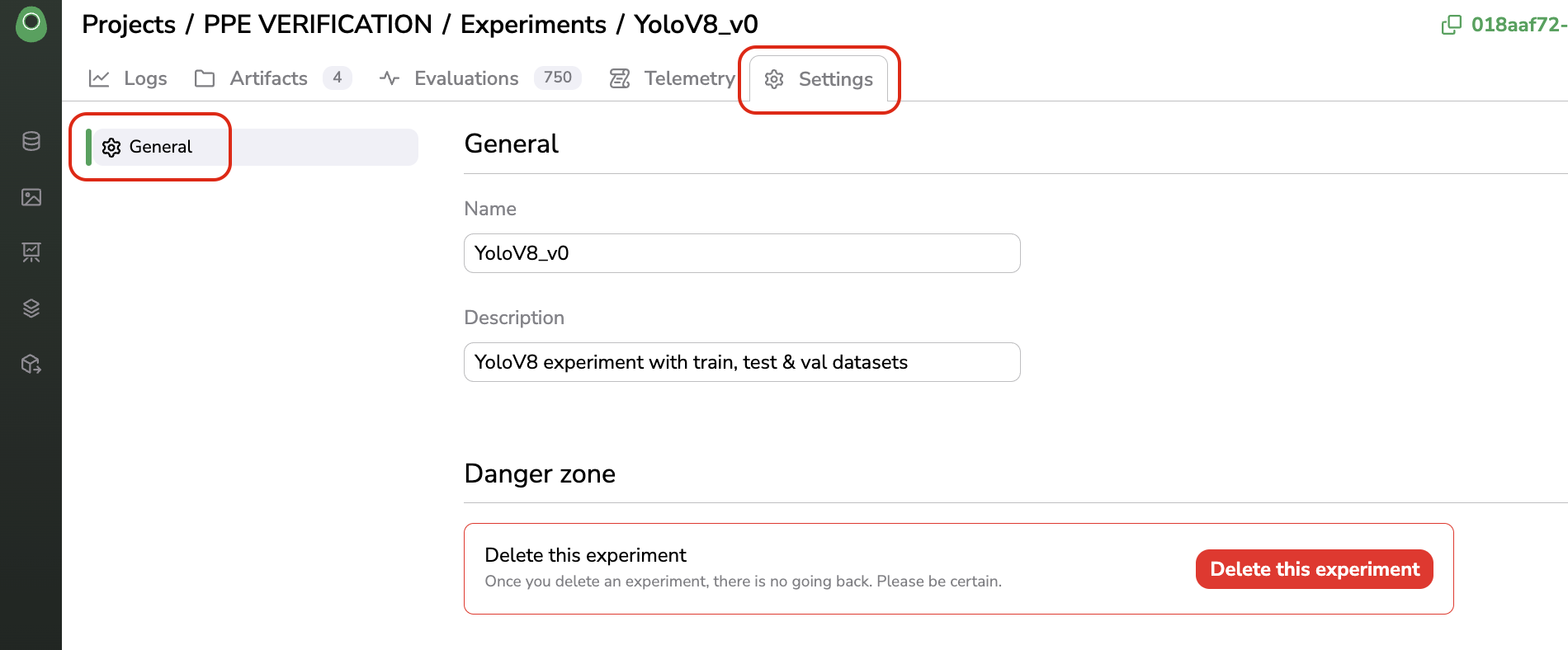
Settings tab
A. General
The General tab lets you update the Experiment's Name and Description, and delete it through the Danger zone.
B. Embeddings
The Embeddings > Data tab lets you activate Data Embeddings for the Experiment. Embeddings are Inactive by default — click on Activate to compute one embedding vector per evaluated image; computation is tracked with a progress indicator and can take a while depending on the number of Evaluation.
Once active, the Embeddings exploration mode of the Evaluations interface, introduced in section 3, unlocks three ways to make sense of your Evaluation beyond browsing them one by one:
- Similarity search: select an
Evaluation, click the Find Similar (eye) icon next to the search bar, and Picsellia surfaces the most visually similarEvaluation, ranked by similarity score. Useful to answer "are there other images like this failure case in myEvaluationset?" - Text-to-image search: click the Text Search (Aa) icon next to the search bar and type a text prompt (for instance, a truck at night); Picsellia returns the
Evaluationthat best match that description. Useful when you have a hypothesis about a failure mode but noTagorMetadatato filter on yet. - UMAP projection: switch to the Embeddings exploration mode to display a scatter plot of every
Evaluationembedding, projected in two dimensions and automatically grouped into clusters. Visually close points represent visually similar images; selecting a cluster (with the lasso, rectangle, or cluster-selection tool) highlights the correspondingEvaluationin the grid.
Why this matters for understanding model behaviorA single accuracy number can't tell you whether your
ModelVersion's errors are scattered randomly or concentrated on a specific kind of image. Clustering yourEvaluationby visual similarity — then checking whether a cluster is dominated by a particular ground truth/prediction mismatch — is what turns "the model has a 12% error rate" into "the model consistently confuses twoLabelon blurry, backlit images," an actionable finding rather than a single score.
These three features and the underlying embeddings computation work the same way across the platform; the full mechanics (technology used, similarity/text search usage, UMAP and clustering parameters) are detailed for the Datalake here and apply identically to Evaluation.
Updated 6 days ago