Experiment - Experiment Tracking
As it is a whole discipline in itself, Picsellia proposes a fully functional Experiment Tracking system that allows you to elevate your workflow and finally achieve top performances. When training AI models, you will perform a lot of different Experiments with different pre-trained ModelVersion, DatasetVersion, sets of parameters, evaluation techniques, etc.
This is a very iterative process that is time-intensive. Once your training script is ready, you will spend a lot of time iterating with all the different variables your final ModelVersion depends on, and launching your script over those variables until you are satisfied with its performance.
One big challenge that you will face as a data scientist, AI researcher, or engineer is that you must be able to store all the important Metrics for each Experiment, store the principal files as Artifact, and finally, compare your Experiment to find the best one.
This whole process is called Experiment Tracking and you can do it seamlessly on Picsellia! In this section, you will learn how 😊.
1. The Experiment Tracking dashboard
As mentioned in the Experiment overview page, each Experiment has its own Experiment Tracking dashboard that is basically a placeholder to be filled with Metrics computed before, during, or after the execution of the training script.
It means that this Experiment Tracking dashboard is fully personalizable and allows the author of the script to log to this dashboard only the metrics he is interested in and that makes sense for him and his team. The creation of Callbacks in the training script to log Metrics on the Experiment Tracking dashboard is detailed on this page of our guide.
If you use as Base Architecture a ModelVersion from the Public registry, the Metrics displayed in the Experiment Tracking dashboard will be the ones defined by the Picsellia team in the training scripts associated with that ModelVersion.
As a reminder, some Metrics can be created during the Experiment creation process. Indeed, for instance, the training parameters will be logged in the Experiment Tracking dashboard as a Table. The initial LabelMap inherited from the Base architecture will also generate a Table in the created Experiment, the LabelMap will for sure be updated with the Label of the DatasetVersion attached to the Experiment as soon as the training script execution is launched.
Below you will find an example of how to log a new Metric and an exhaustive list of Metrics types supported.
2. The Log method
Logging a new Metric to Picsellia is as simple as this :
from picsellia import Client
from picsellia.types.enums import LogType

api_token = 'YOUR TOKEN'
project_name = 'My awesome Project'

client = Client(api_token)
project = client.get_project(project_name)

experiment = project.get_experiment(
    name='my_new_experiment'
    )

data = [3, 1.25, 1.4, 0.35, 0.95]
experiment.log('TotalLoss', data, LogType.LINE)
A new Metric has been created in the Experiment Tracking dashboard of your Experiment:
.png")
A Metric displayed in the Experiment Tracking dashboard
What you just created is what we call a Log asset, now we will dive into it to see how to use it properly and how far we can go.
3. The Log object
Log objectTo store something related to an Experiment and visualize it in Picsellia, you have to store it in what we call a Log, it is composed of the following properties:
- name, is the name of the tab you will see in your experiment, it can group several data assets.
- data, is the value, dictionary, array, or image, that you want to store.
- type, the type of visualization you want to render your asset in (e.g. array, line chart, bar chart...).
from picsellia.types.enums import LogType

experiment.log(name='logs', data=data, type=LogType.LINE)
4. Metric types
Here is the list of Metric types supported for now:
class LogType(StrEnum):
    VALUE = "VALUE"
    IMAGE = "IMAGE"
    LINE = "LINE"
    TABLE = "TABLE"
    BAR = "BAR"
    HEATMAP = "HEATMAP"
    LABELMAP = "LABELMAP"
    EVALUATION = "EVALUATION"
A. Single Value
Store one value to be displayed alone. It can be of any type (int, float, str...)
experiment.log(name='accuracy', type=LogType.VALUE, data=0.95)Single values will appear in your experiment dashboard in the summary at the top of the page like this:
.png")
SIngle Value Metric
B. Line
A basic line chart:
data = [3, 8, 2, 7, 9]
experiment.log(name='logs', type=LogType.LINE, data=data).png")
Line Metric
If you hover over a Line or Multi-Line Metric, the associated values will be displayed for the Metric. You can also draw a square on the chart area to zoom on the selected area.
The format of your data to display a line-chart must be one of the following.
a. List format
If you don't specify it, we automatically increment the steps (x_axis) for you so you can just send their values like this:
experiment.log(name='logs', type=LogType.LINE, data=[5, 8, 2, 9, 10])
Fill-in the MetricIf there is already existing data with the name you provided ('logs' in this example), the values will be appended to the current list of values. It allows for instance to real time track on Picsellia the evolution of a Metric during a training.
.png")
Line Metric
If you want to completely replace the existing values with a brand new list you can set the replace parameter to True
experiment.log(name='logs', type=LogType.LINE, data=[5, 8, 2, 9, 10], replace=True)b. Custom Axis
If you want to specify your own x_axis steps, you can send the data this way:
data = {
    'steps': [0, 2, 4, 8, 10],
    'values': [0.7, 0.8, 0.9, 0.3, 0.12]
}
experiment.log(name='logs', type=LogType.LINE, data=data)
C. Multi Lines
You can also visualize multiple lines on the same chart by adding keys to your dictionary (with or without steps):
data = {
    'loss1': [0.45, 0.2, 0.98, 0.47, 0.28],
    'loss2': [0.7, 0.8, 0.9, 0.3, 0.12],
    'loss3': [0.21, 0.47, 0.74, 0.56, 0.86]
}
experiment.log(name='logs', type=LogType.LINE, data=data)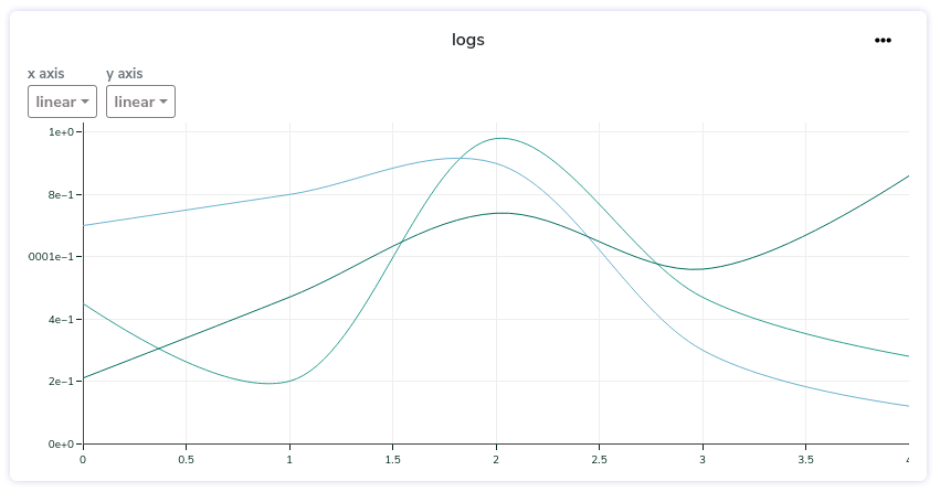
D. Bar
A basic bar chart:
data = {
    'x': ['car', 'person', 'birid'],
    'y': [5, 8, 2],
}
experiment.log(name='labels', type=LogType.BAR, data=data)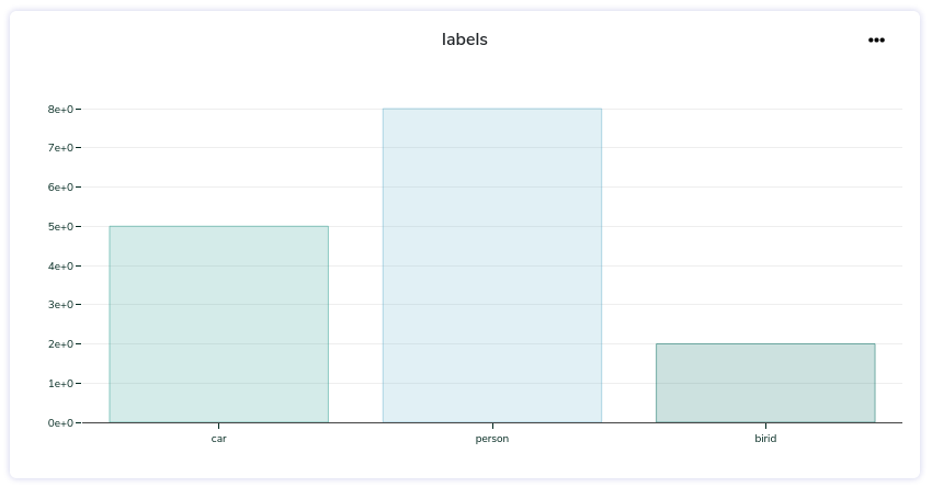
E. Table
data = {
    "Loss/total_loss": 1.202446,
    "Loss/localization_loss": 0.022069892,
    "Loss/classification_loss": 1.1457626,
    "Loss/regularization_loss": 0.034613654,
    "DetectionBoxes_Recall/AR@1": 	0.0
}
experiment.log(name='metrics', type=LogType.TABLE, data=data)
F. Image
path = "path/to/my/image.jpg"
experiment.log("img3", type=LogType.IMAGE, data=path)
G. Heatmap
What is False negative and False positive?Please note that you can send an array of values whose shape is (N+1xN+1) whereas the list of your categories as a length of N. The last dimensions of the array will be labeled as FP (False Positive) and FN (False Negative).
conf = [[33,  0, 13],
       [ 2,  7, 16],
       [10,  0,  0]]

confusion = {
    'categories': ['car', 'pedestrian'],
    'values': conf
}
exp.log(name='confusion', data=confusion, type=LogType.HEATMAP)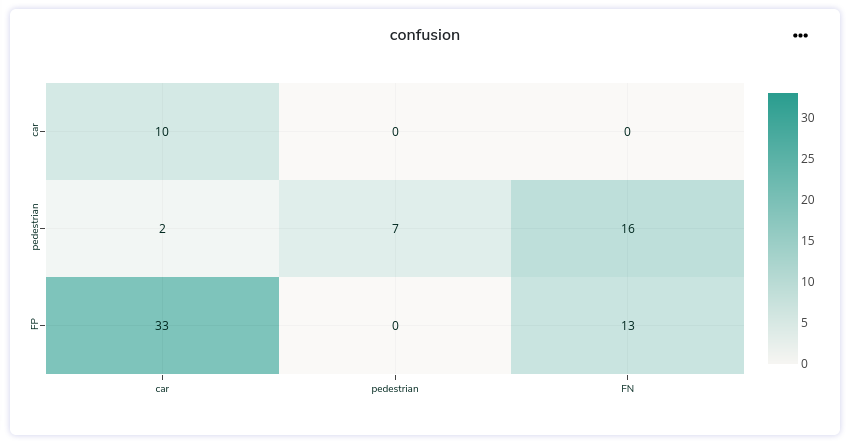
Updated about 1 year ago