For AI agents: visit https://documentation.picsellia.com/llms.txt for an index of all pages formatted in Markdown and endpoints in OpenAPI. Append .md to any documentation page URL to get its markdown version.
Charts let you build custom aggregate visualizations over your DatalakeData, alongside the Query Language and Embeddings exploration modes detailed here.
For instance, you can track the volume of Data uploaded over time, or build a histogram of file sizes.
For a Computer Vision project, this kind of aggregate view is what surfaces problems that are invisible image by image: a DataTag breakdown can reveal a class imbalance before it skews training, a chart grouped by Source can confirm all your acquisition sites or cameras are still feeding the Datalake, and a volume-over-time chart can flag a sudden drop or spike in ingestion worth investigating.
This feature has also been designed to support very large volumes of Data. The computation of a chart is highly optimized and performed on Picsellia's side; this way, you do not need to fetch all your Datalake and associated properties/Metadata/Tag locally with the SDK anymore, which is painful and time-consuming, to build custom metrics. Everything is centralized on Picsellia and available for every member of the Organization.
1. Accessing Charts
Charts are available in two places:
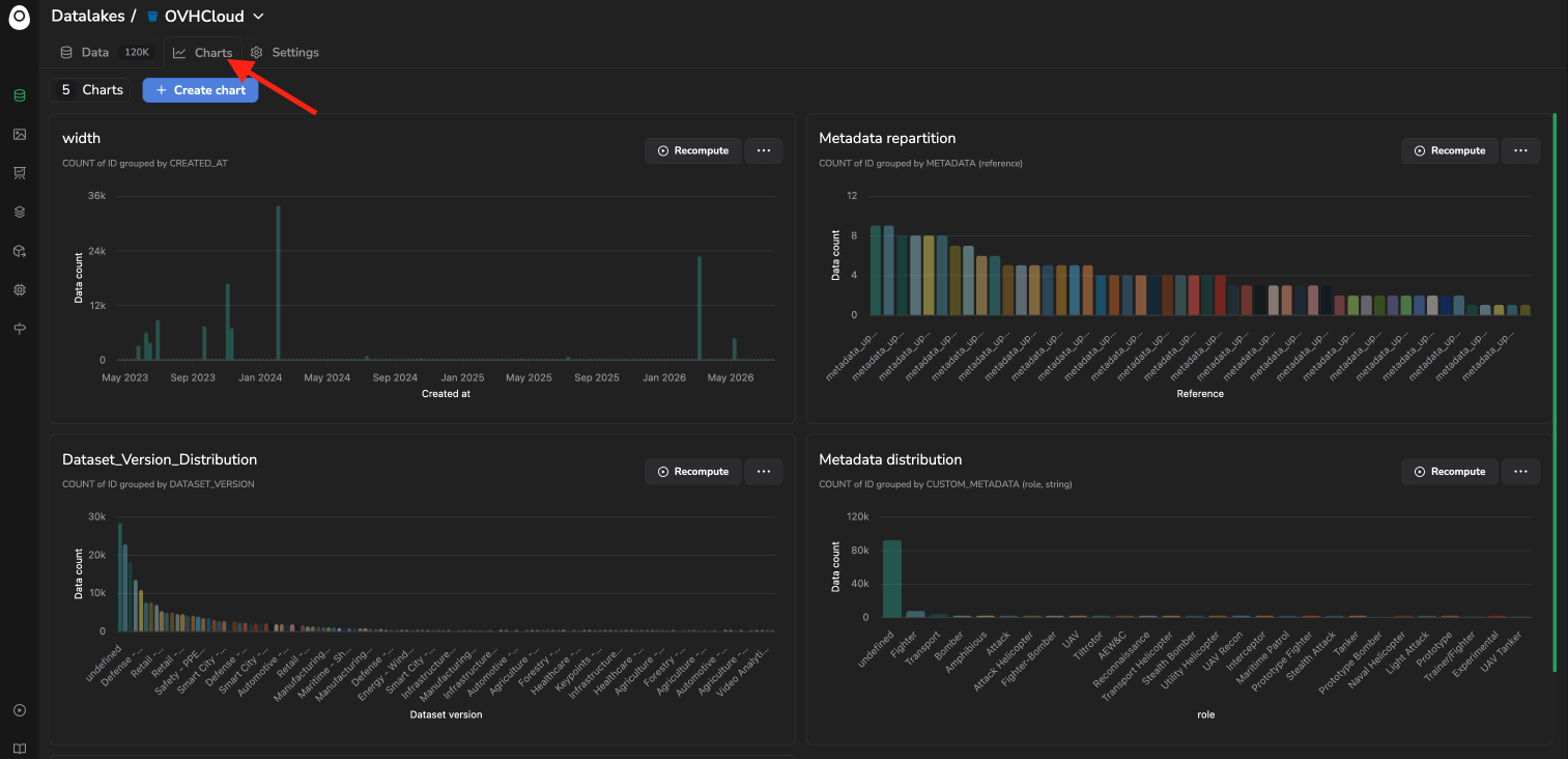
The Charts tab at the top of the Datalake, listing every chart created so far.
Charts tab in the Datalake
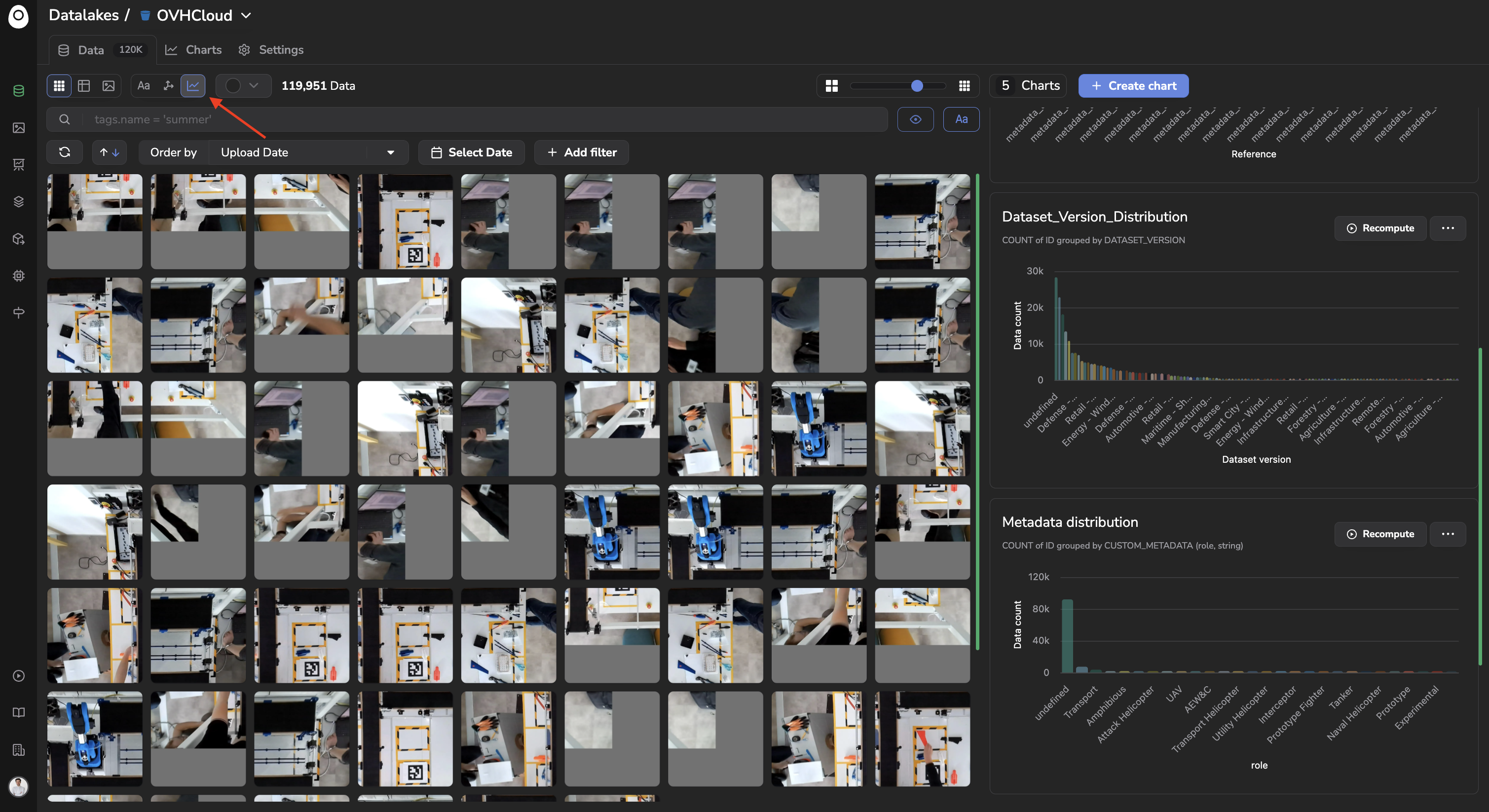
The Charts option of the exploration mode selector next to the search bar, which displays the Data grid alongside the Charts panel for side-by-side exploration.
Charts exploration mode
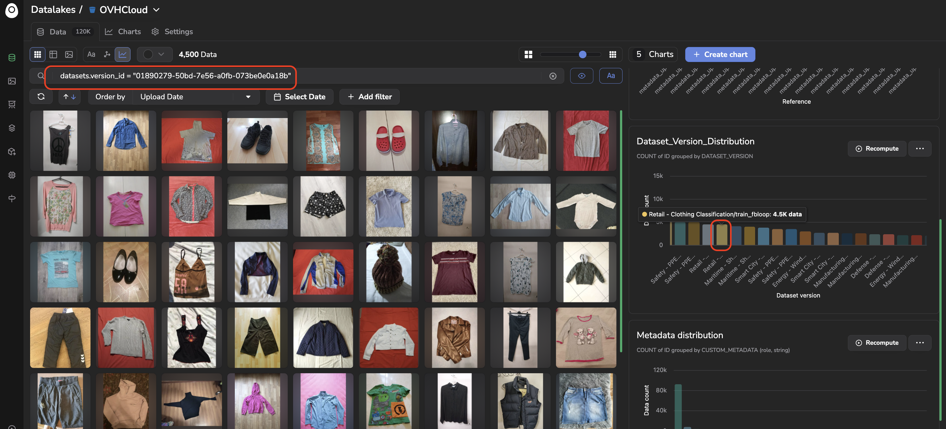
Clicking on a bar of a chart automatically filters the Data displayed in the chosen view (Grid, Table, or Details) to only the ones matching that bar, by applying the equivalent query in the search bar. This drill-down is especially useful when Charts are opened in the side-by-side exploration mode: spotting an anomaly on a chart (a spike, a drop, an overrepresented Tag) and immediately visualizing the corresponding images or videos, right next to it, without having to rebuild the query yourself.
Clicking on a bar from a Chart will display associated images by automatically generating the associated query
📘
Charts are available across the platform
This same Charts mechanism, including the click-to-filter drill-down, is also available on DatasetVersion (detailed here), Evaluation (detailed here), and Deployment predictions overviews.
📊
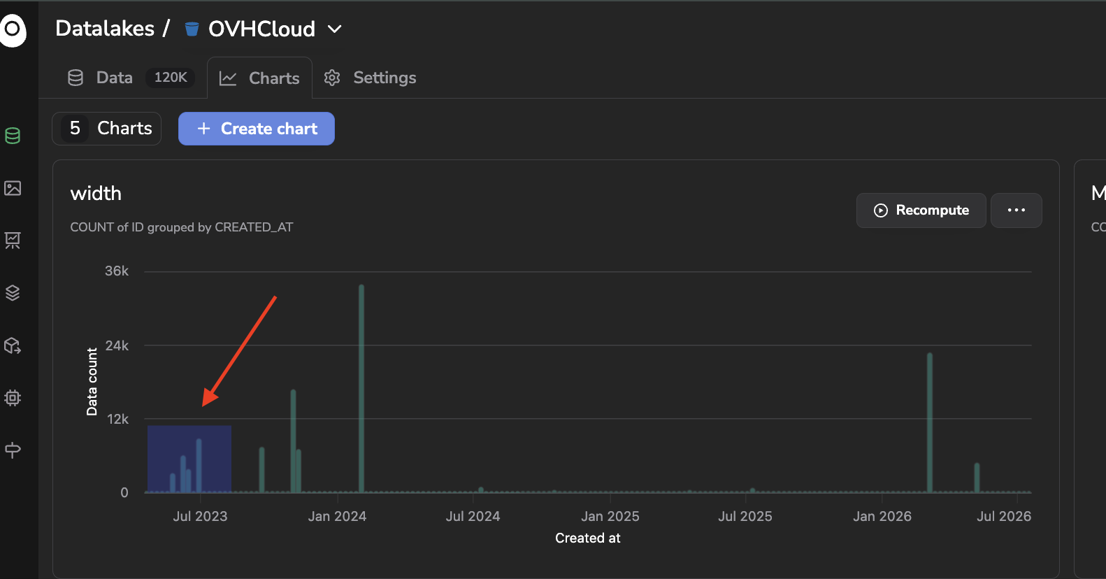
Zoom in your chart
You can zoom in on a specific part of your chart by drawing a square around the region of interest, this part will then be focused on. To reset the zoom you simply need to double click anywhere on the Chart.
Zoom in
2. Creating a Chart
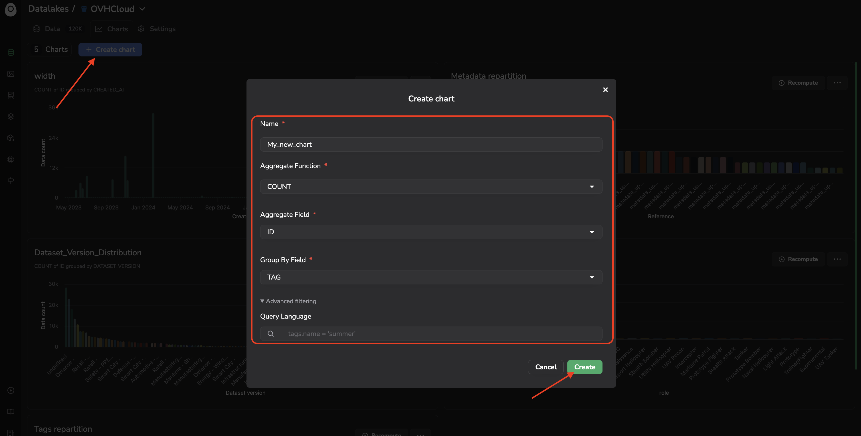
Click + Create chart to open the creation form:
Name: the name of your chart.
Aggregate Function: AVG, COUNT, MAX, MIN, or SUM.
Aggregate Field: the field to aggregate, for instance ID (to count Data) or a Custom Metadata field.
Group By Field: the field used to bucket the results, for instance CREATED_AT, CONTENT_TYPE, UPLOAD_STATUS, FILE_SIZE, TAG, SOURCE, METADATA, CUSTOM_METADATA, DATASET_VERSION, or DEPLOYMENT. This field is optional: leaving it empty produces a Metric chart, a single aggregate value computed over the whole selection instead of a breakdown.
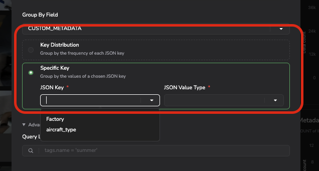
JSON Key: when the aggregated or grouped field is a Custom Metadata one, an additional JSON Key input tells Picsellia which key to read. It suggests the keys declared in the Custom Metadata schema of the Datalake (see Metadata), so you do not have to remember how each one is spelled, and still accepts a key typed by hand when the schema does not declare it.
Advanced filtering: optionally scope the chart to a subset of Data using the same Query Language as the Search Bar, detailed here. It allows the Chart to only consider a subset of Data.
Chart creation form
JSON key configuration in case of a chart using Custom Metadata
Once created and computed, your chart is displayed as a card showing the resulting visualization, for instance, a bar chart of the Data count aggregated by creation date.
Please note that the "Aggregate field" and "Group by field" vary depending on the object for which you are creating a Chart; indeed, you do not have access to the same properties/fields whether you are creating a Chart in your Datalake, DatasetVersion (annotation- or attributes-related fields will additionally be available) or Evaluation (COCO metrics-related fields will be available).
3. Managing Charts
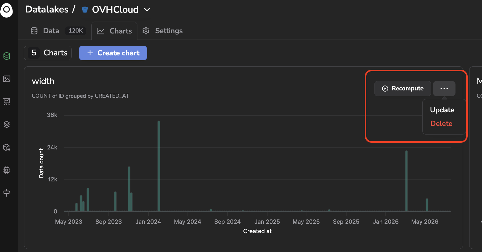
From a chart's card, you can:
Recompute: refresh the chart with the latest Data.