

Charts
Charts let you build custom aggregate visualizations over the Evaluation of an Experiment, alongside the Query Language and Embeddings exploration modes of the Evaluations interface.
Browsing Evaluation one image at a time is how you catch an individual failure; Charts are how you catch a pattern across hundreds or thousands of them. For a Computer Vision team, this kind of aggregate view is what turns "the model is sometimes wrong" into an actionable finding: a breakdown of average precision by DataTag can reveal that a specific acquisition condition (night, occlusion, a particular camera) is dragging down performance, and a breakdown by Label can reveal that one class is systematically confused with another.
1. Accessing Charts
Charts are available in two places:
-
The Charts tab at the top of the
Experiment, listing every chart created so far.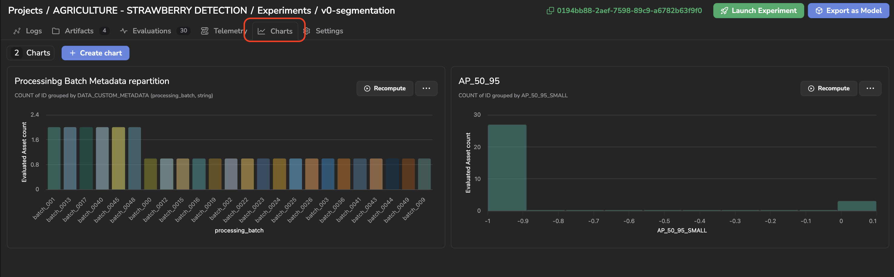
Chart tab
-
The Charts option of the Evaluations exploration mode selector, which displays the
Evaluationgrid alongside theChartspanel for side-by-side exploration.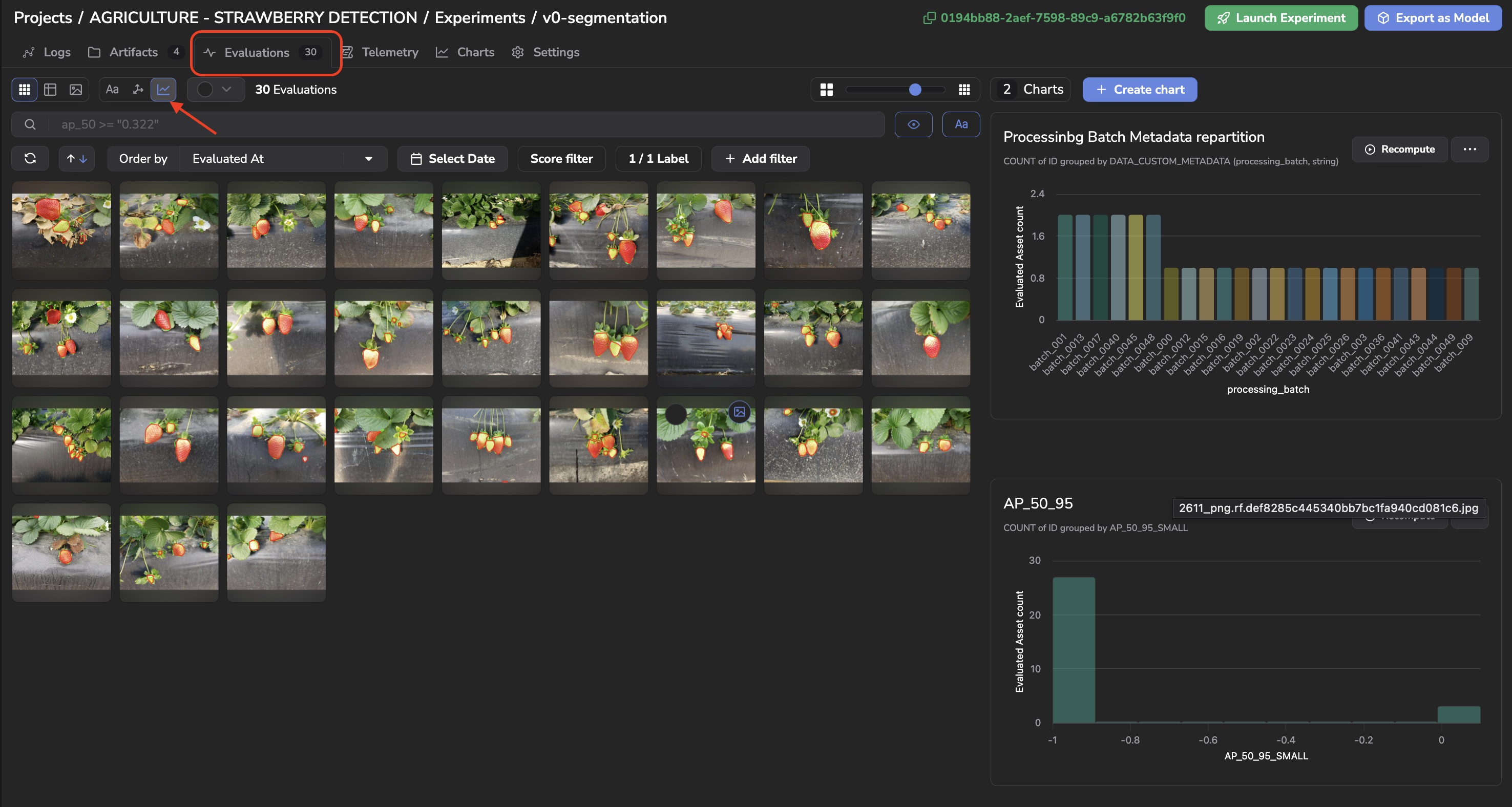
Chart exploration mode for Evaluations
Clicking on a bar of a chart automatically filters the Evaluation displayed to only the ones matching that bar, by applying the equivalent query in the search bar, the same way it does on the Datalake and a DatasetVersion, detailed here. This drill-down is especially useful in the side-by-side exploration mode: spotting an anomaly on a chart and immediately visualizing the corresponding Evaluation, right next to it, ground truth and prediction included.
2. Creating a Chart
Click + Create chart to open the creation form:
-
Name: the name of your chart.
-
Aggregate Function:
AVG,COUNT,MAX,MIN, orSUM. -
Aggregate Field: the field to aggregate —
ID(to countEvaluation),CUSTOM_METRICS, orDATA_CUSTOM_METADATA. -
Group By Field: the field used to bucket the results. This field is optional: leaving it empty produces a Metric chart, a single aggregate value computed over the whole selection instead of a breakdown. You can group by:
- The
Evaluation's own COCO-style detection metrics, computed automatically by Picsellia for everyEvaluation:AP_50_95,AP_50,AP_75,AP_50_95_SMALL,AP_50_95_MEDIUM,AP_50_95_LARGE,AR_50_95_DET1,AR_50_95_DET10,AR_50_95_DET100,AR_50_95_SMALL,AR_50_95_MEDIUM,AR_50_95_LARGE,TRUE_POSITIVES,FALSE_POSITIVES, andFALSE_NEGATIVES. CUSTOM_METRICS, the metrics you logged yourself on theEvaluation(see the callout below).- Fields inherited from the underlying
Data:DATA_CREATED_AT,DATA_CONTENT_TYPE,DATA_UPLOAD_STATUS,DATA_FILE_SIZE,DATA_TAG,DATA_SOURCE,DATA_METADATA, orDATA_CUSTOM_METADATA. - Fields inherited from the underlying
Asset:ASSET_CREATED_ATorASSET_TAG.
- The
-
Advanced filtering: optionally scope the chart to a subset of
Evaluationusing the same Query Language as the Search Bar.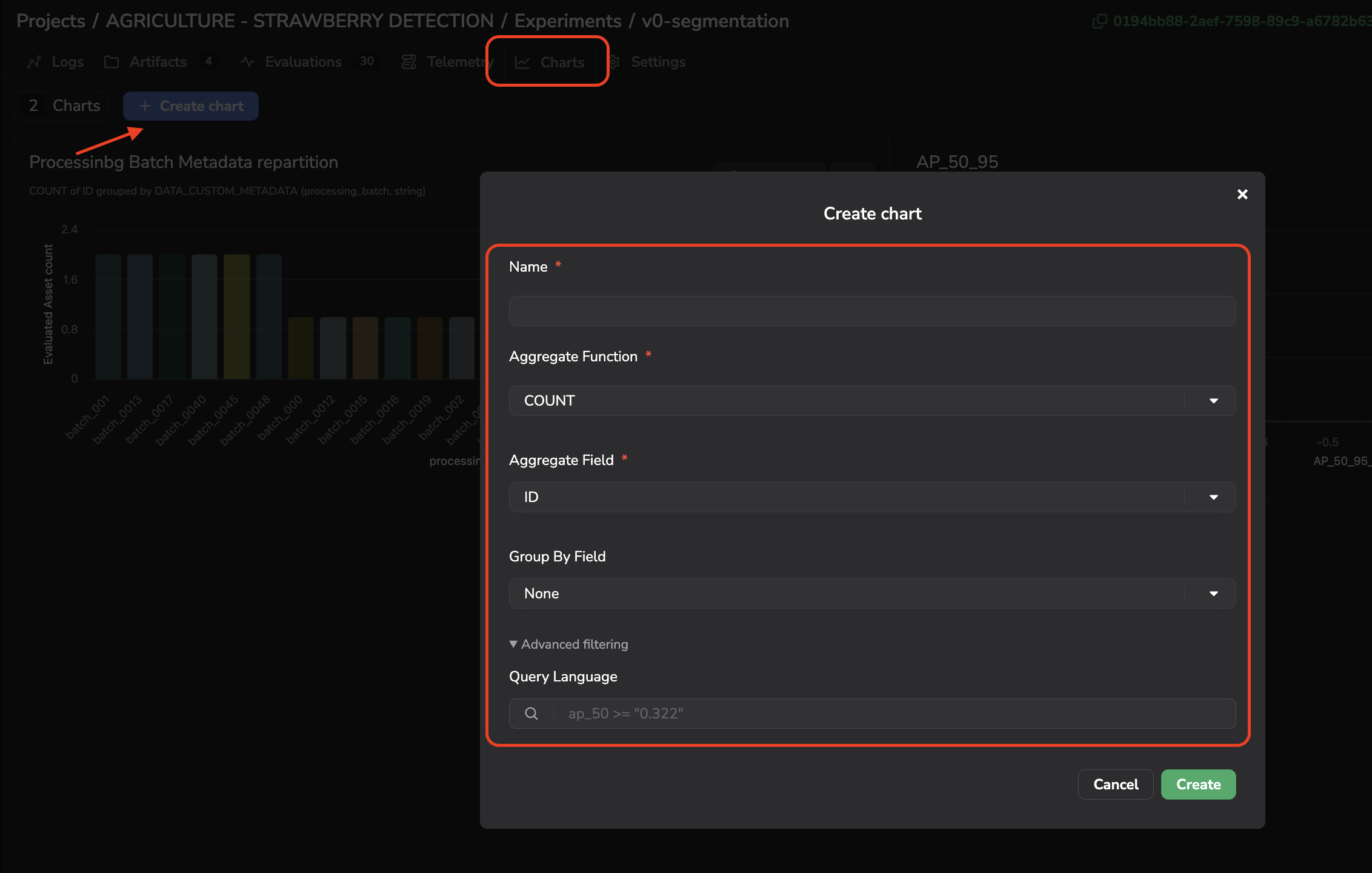
Chart creation form
For instance, a chart of the average AP_50_95 grouped by DATA_TAG lets you compare your ModelVersion performance across the different conditions tagged in your Data.
Custom Metrics are SDK-only for nowLogging a
Custom Metricon anEvaluation— for instance a domain-specific score your training script computes in addition to the standard COCO metrics — is only possible through the SDK at the moment. There is no dedicated panel yet to browseCustom Metricson anEvaluation's Details view; aChartaggregating or grouping byCUSTOM_METRICSis, for now, the only way to visualize this data on the platform.
Once created and computed, your chart is displayed as a card showing the resulting visualization.
3. Managing Charts
From a chart's card, you can:
- Recompute: refresh the chart with the latest
Evaluation. - Update or Delete: from the ... menu.
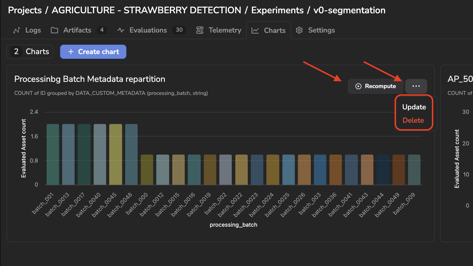
Chart management options
Updated 23 days ago