

Analytics and Charts
Once a DatasetVersion is annotated, Picsellia gives you two complementary ways to assess and explore it in aggregate, on top of browsing Asset one by one: the Analytics tab, and the Charts tab.
1. Analytics
Once your DatasetVersion is annotated, Picsellia automatically computes several metrics that can be used to assess the quality of your Dataset.
To visualize them, you can jump into the Analytics tab of your DatasetVersion:
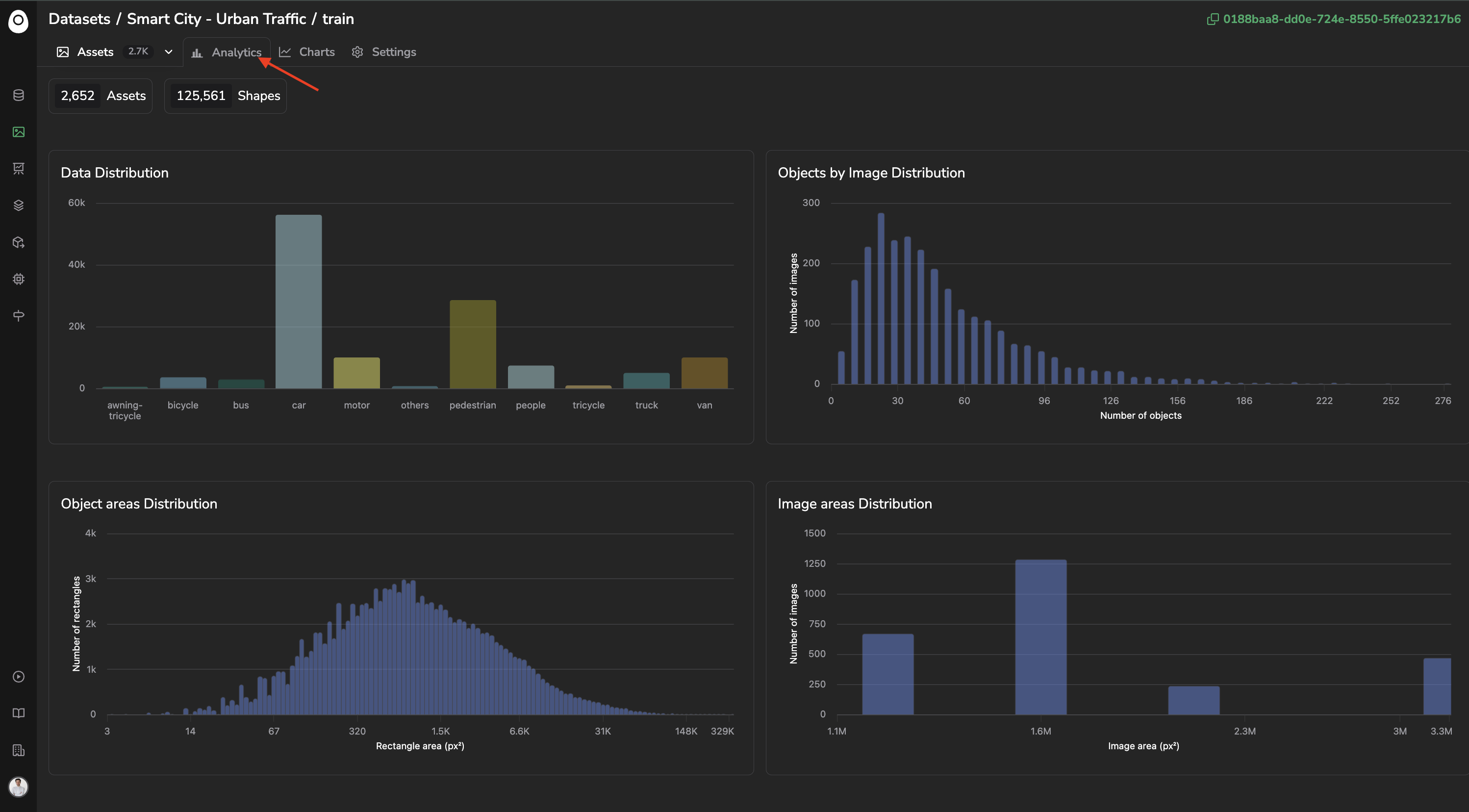
Analytics
You can obviously hover over any bar from any chart to get the analytics details.
In case an Annotation Campaign is ongoing on the currentDatasetVersionIn case an Annotation Campaign is ongoing, the Analytics tab will be enriched with additional metrics, they are described in details here
2. Charts
Charts let you build custom aggregate visualizations over the Asset of a DatasetVersion, alongside the Query Language and Embeddings exploration modes detailed here.
For a Computer Vision project, this kind of aggregate view is what surfaces invisible problems Asset by Asset: a breakdown by Label can reveal a class imbalance before it skews training, a breakdown by Custom Metadata can help track representativity of the current DatasetVersion, and a breakdown by AssetTag can confirm a train/test/val split is balanced as expected.
A. Accessing Charts
Like the Datalake, Charts are available from the Charts tab at the top of the DatasetVersion, listing every chart created so far and from the side-by-side exploration mode combining Charts with the Assets overview.
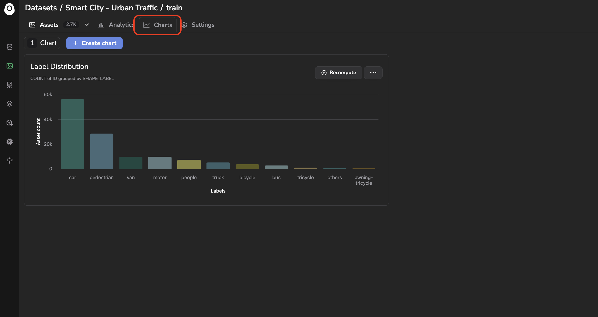
Accessing Charts tab
Clicking on a bar of a chart automatically filters the Asset displayed in the Assets overview to only the ones matching that bar, by applying the equivalent query behind the scenes, the same way it does on the Datalake, detailed here.
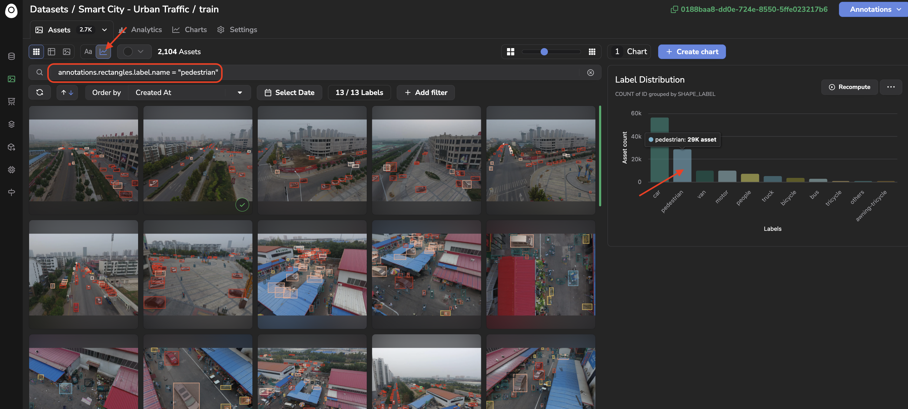
Visualization of one bar through automatically filled query
B. Creating a Chart
Click + Create chart to open the creation form:
- Name: the name of your chart.
- Aggregate Function:
AVG,COUNT,MAX,MIN, orSUM. - Aggregate Field: the field to aggregate, for instance
ID(to countAsset),DATA_CUSTOM_METADATA,SHAPE_ATTRIBUTES, orANNOTATION_ATTRIBUTES(i.e.Asset Attribute). - Group By Field: the field used to bucket the results.
Asset-specific fields includeCREATED_AT,TAG(i.e.AssetTag),SHAPE_LABEL,SHAPE_TEXT,SHAPE_AREA,SHAPE_ATTRIBUTES, andANNOTATION_ATTRIBUTES(i.e.Asset Attribute). You can also group by fields inherited from the underlyingData:DATA_CREATED_AT,DATA_CONTENT_TYPE,DATA_UPLOAD_STATUS,DATA_FILE_SIZE,DATA_TAG,DATA_SOURCE,DATA_METADATA,DATA_CUSTOM_METADATA,DATA_DATALAKE, orDATA_DEPLOYMENT. This field is optional: leaving it empty produces a Metric chart, a single aggregate value computed over the whole selection instead of a breakdown. - Advanced filtering: optionally scope the chart to a subset of
Assetusing the same Query Language as the Search Bar, detailed here.
For instance, below a Chart showing the average Shape area grouped by Label name is being created:
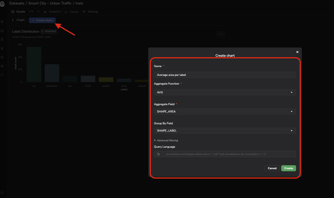
Chart creation
Once created, your chart is displayed as a card showing the resulting visualization, for instance a bar chart of the average Shape area aggregated by SHAPE_LABEL.
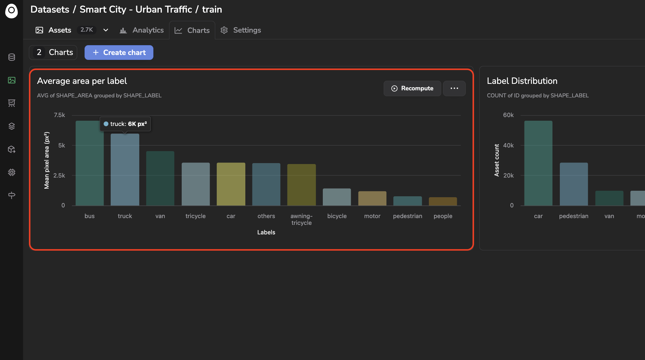
Chart created
Please note that a Chart can be created the same way from the side-by-side view:
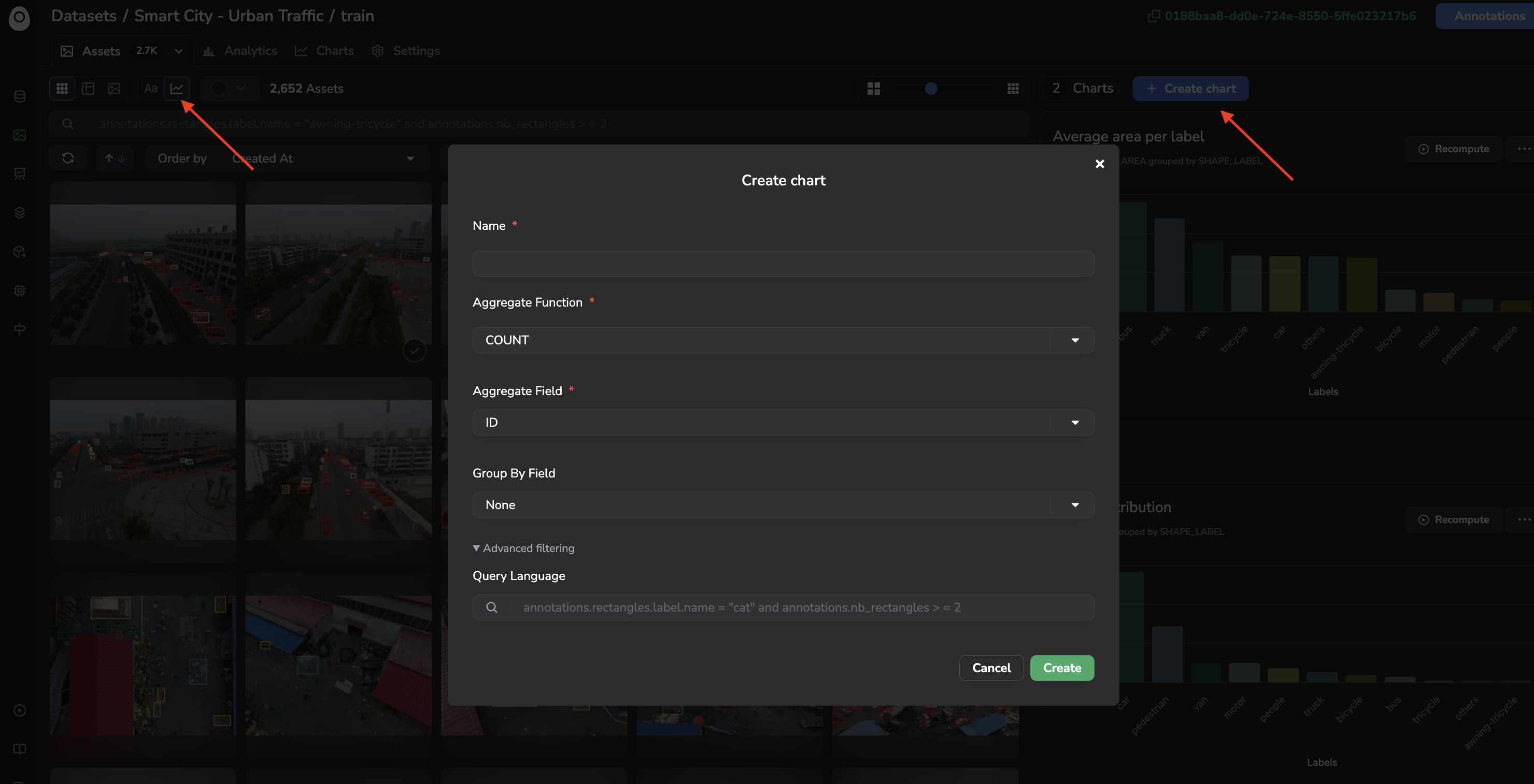
Chart creation from side-by-side view
C. Managing Charts
From a chart's card, you can:
- Recompute: refresh the chart with the latest
AssetandAnnotation. - Update or Delete: from the ... menu.
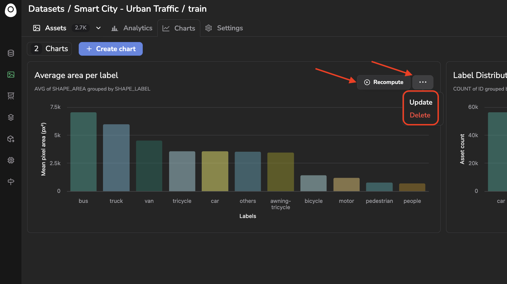
Recompute, update, or delete a Chart
Updated about 2 months ago